BEEFEATER MODULAR DISPLAY
Nationwide
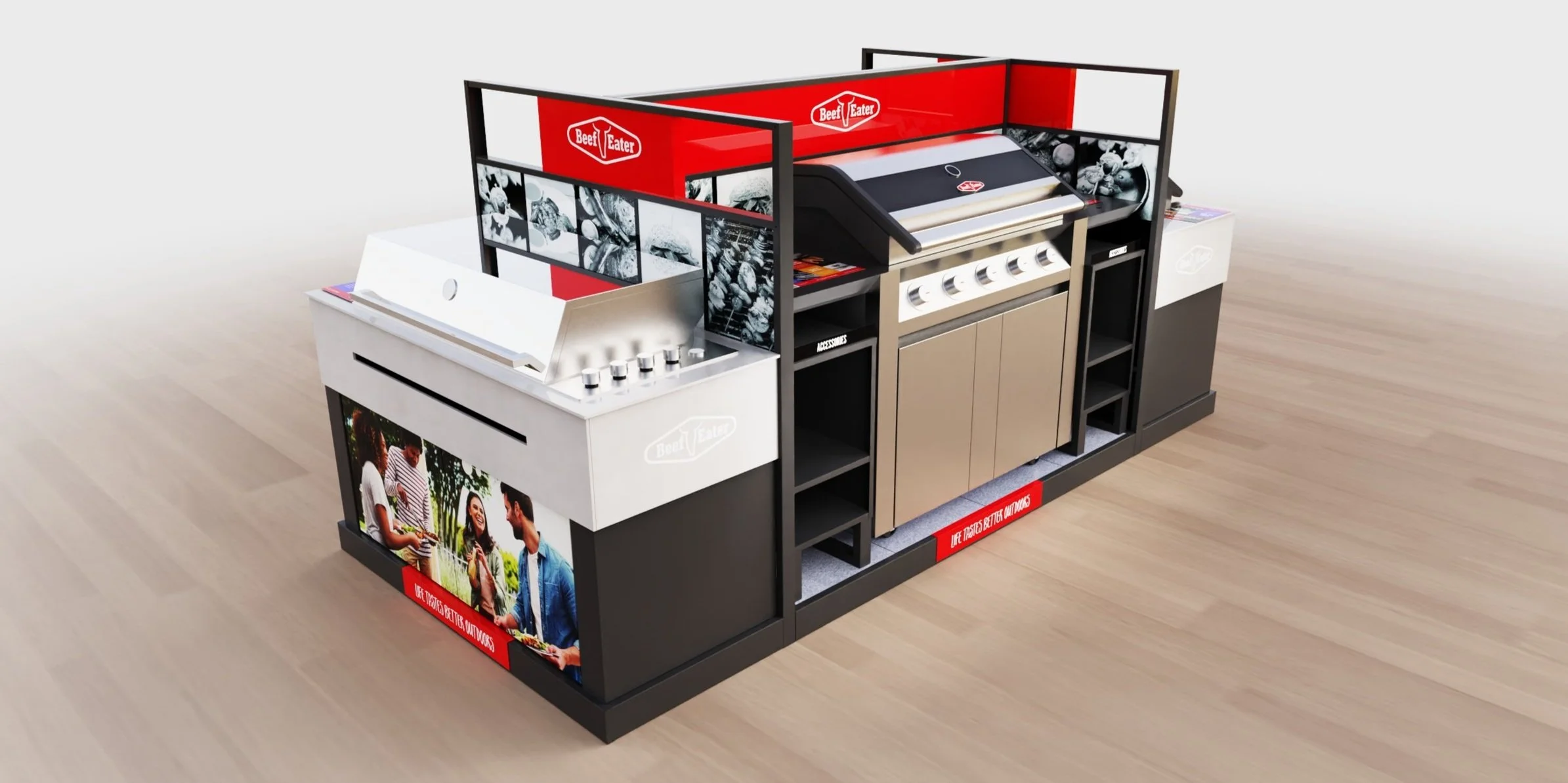
Beefeater "The Ultimate BBQ Experience" required a new design to accompany their launch into a new retailer. A modular design approach allowed the displays to breakdown into multiple configurations (4) as single / double / triple and quad units showcasing core product range.
The solution was a fabricated steel frame modular design with printed interchangeable hex-board graphic panels, which could be sized to suit any footprint.
The combination of materials created instore theatre and interest, with printed floor tiles and lifestyle images, and raw fibre cement panels used on the endcaps.
The fibre cement used, is a sustainable product made from a mixture of cement, sand, water, and cellulose fibre, sourced from sustainably grown pine trees. Visually the fibre cement created a realistic onsite BBQ zone on the endcaps.
CRICUT GONDOLA ISLAND
Harvey Norman
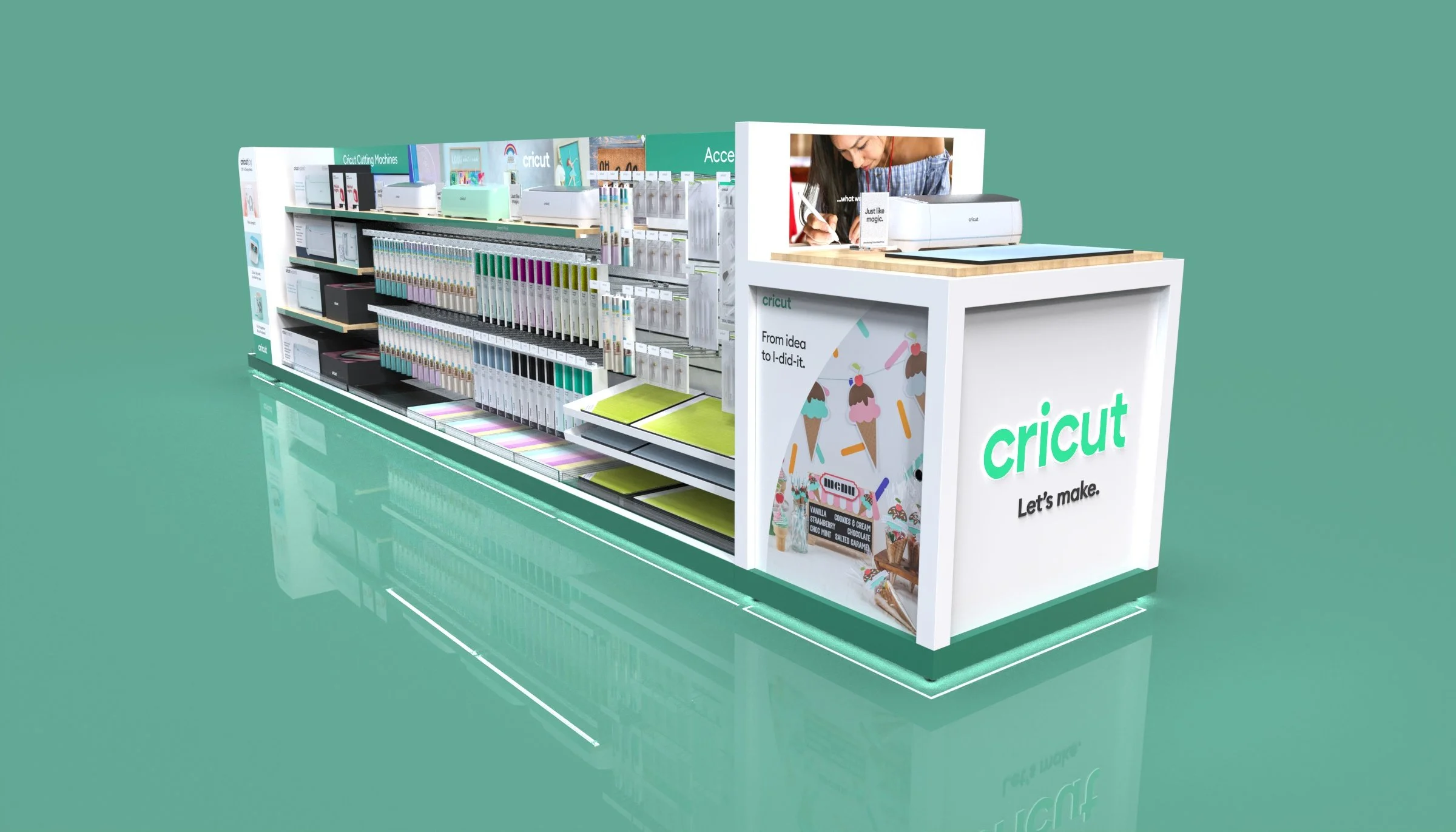
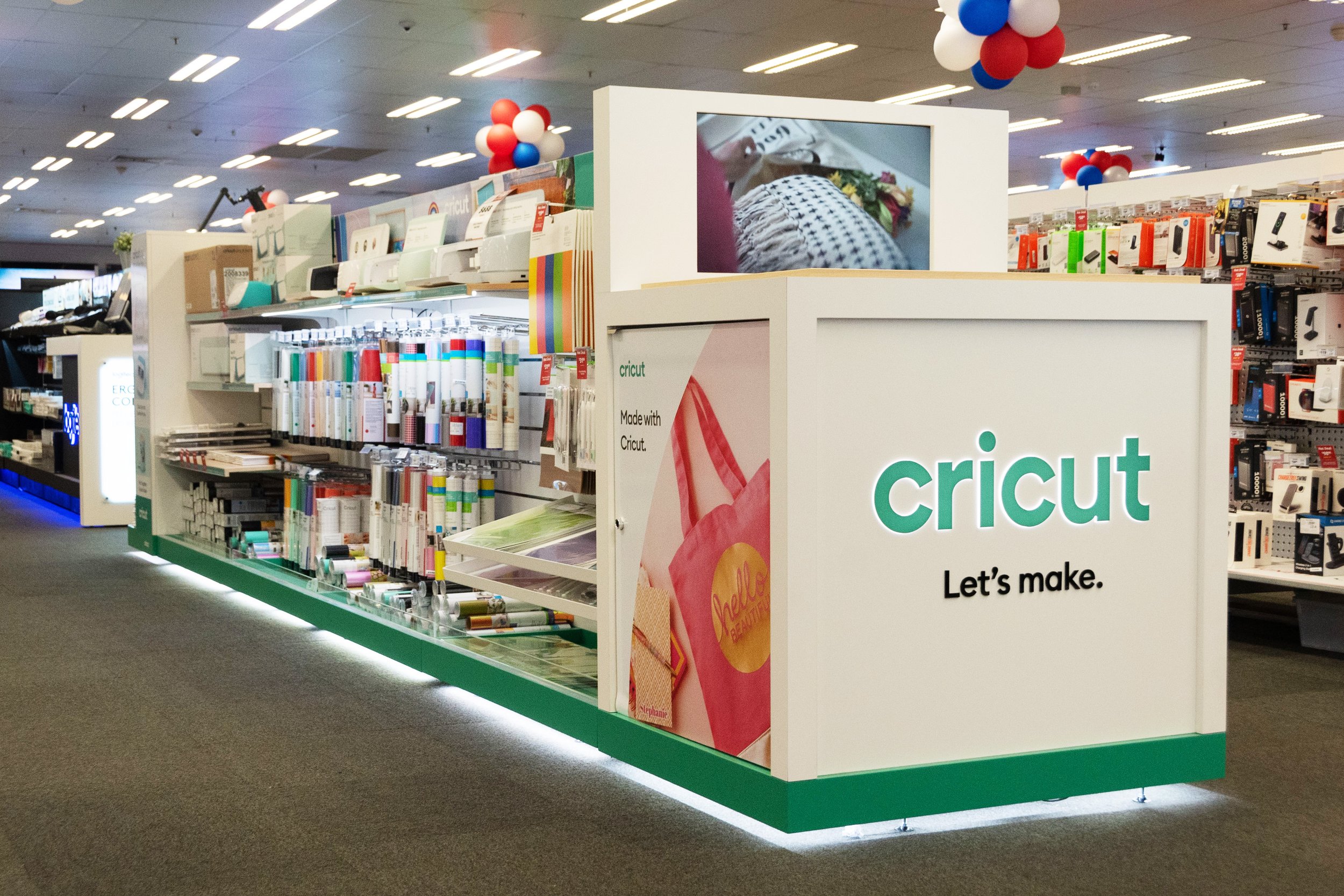
We count ourselves lucky to have secured the work of one of the hottest names in the DIY world of recent years. Cricuts business is growing like few other brands and so is their need for retail space. The range is huge and ever expanding and every millimeter counts. No worries. We’ve made it work.
DELONGHI COFFEE END CAP
The Good Guys nationwide
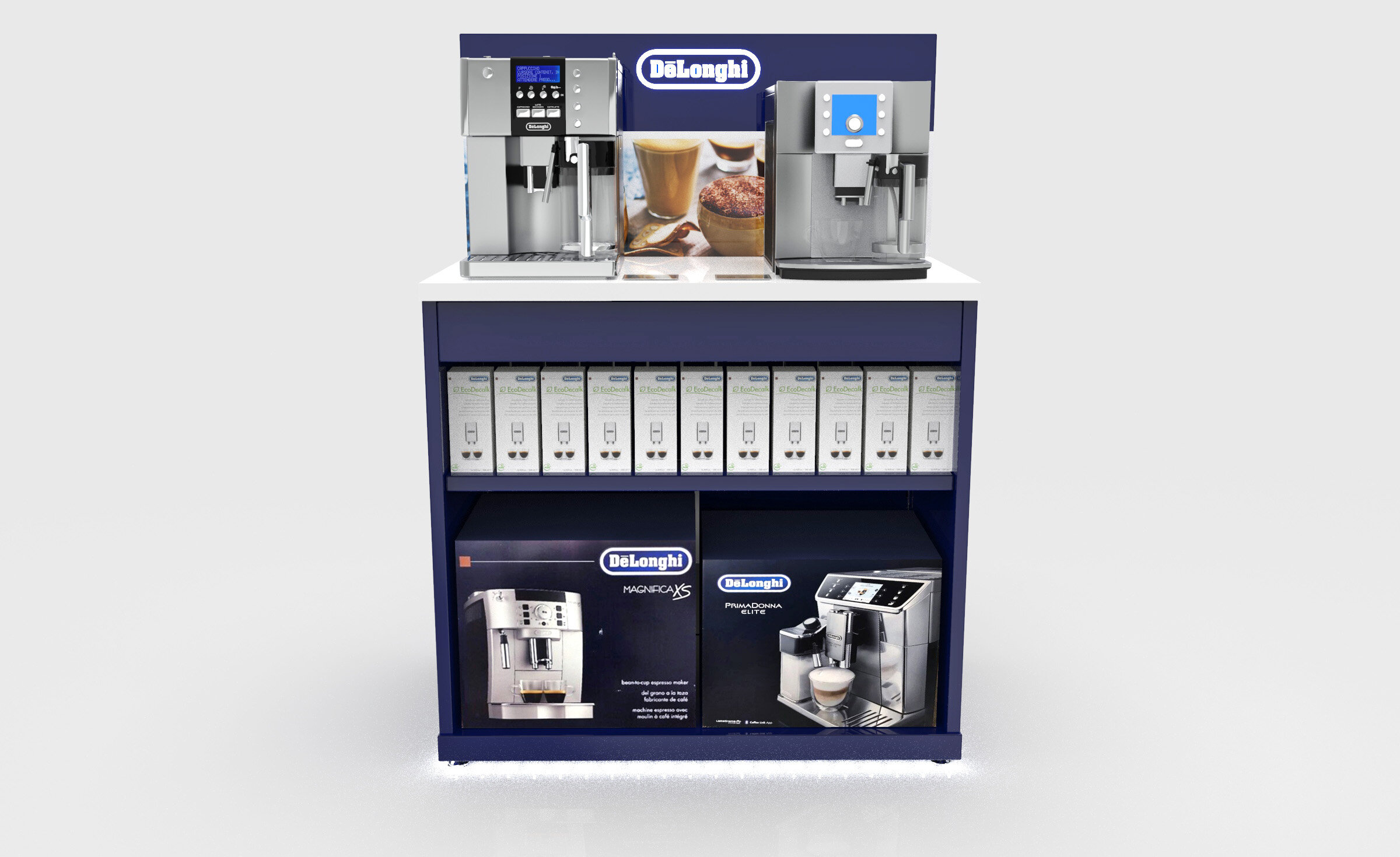
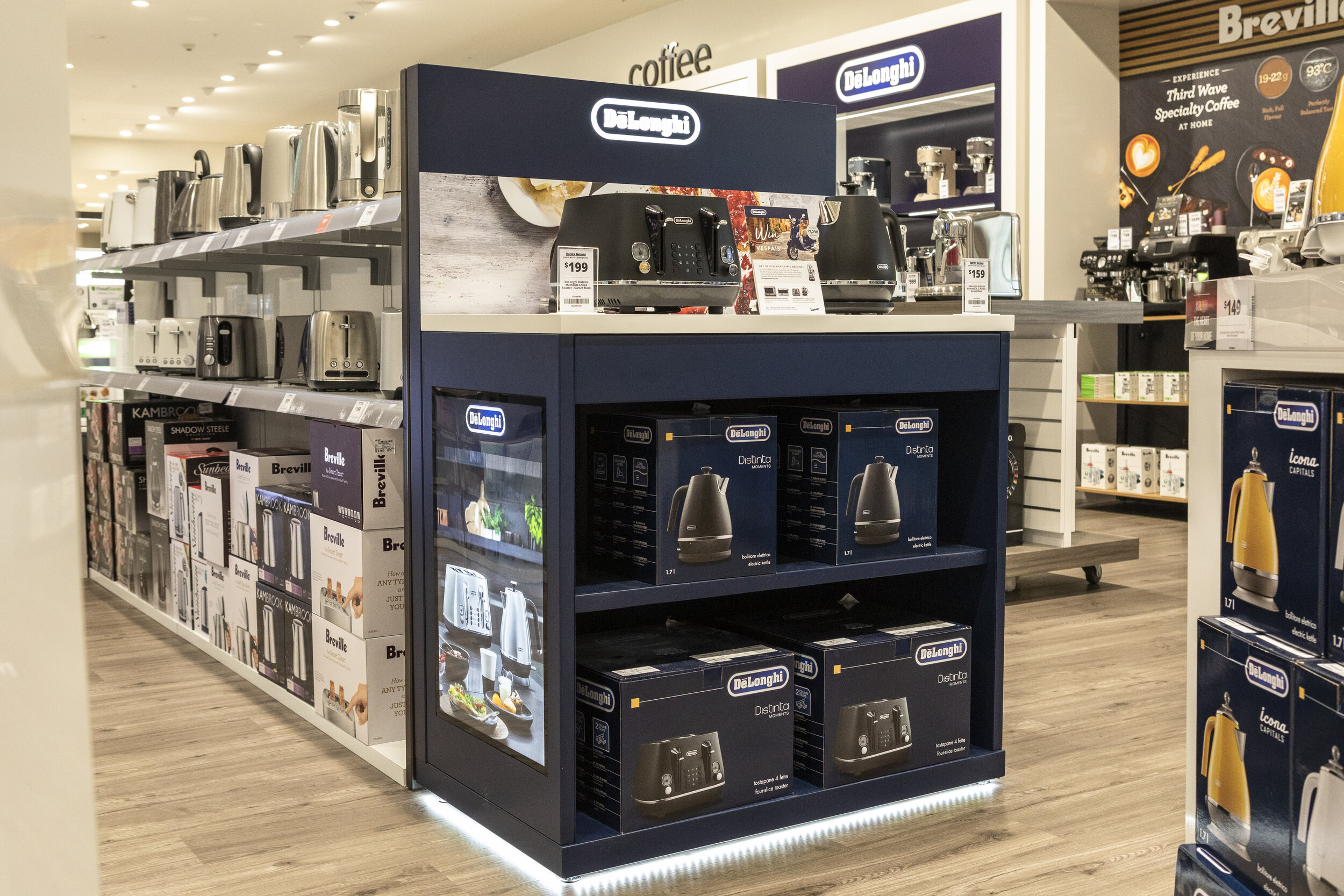
One of our most recent projects to hit stores nationwide, are our Delonghi Coffee End Caps.
With maximum versatility these units key features include:
Effective use of lighting: highlighting branding, graphical elements and to draw the eye to the stand with full base halo lighting
Adjustable shelving to house all accessories and boxed products
Secure Storage drawer – to keep coffee beans and tools in store demonstrations
Interchangeable magnetic graphics which are easily updated for product launches and promotions
Sustainability and future proofing our designs for our client is really important to us, these displays are of the highest quality – yet offer an incredible value for money as they can be used to display multiple products for years to come.
DELONGHI BREAKFAST END CAP
The Good Guys nationwide
Even though the main focus at time of brief was the coffee range it was also always crucial to keep the endcap updatable for future promotions. With the interchangeable graphics and the adjustable shelving this was no problem when the breakfast range came into the lime light.
DELONGHI COFFEE ACCESSORIES STAND
Nationwide
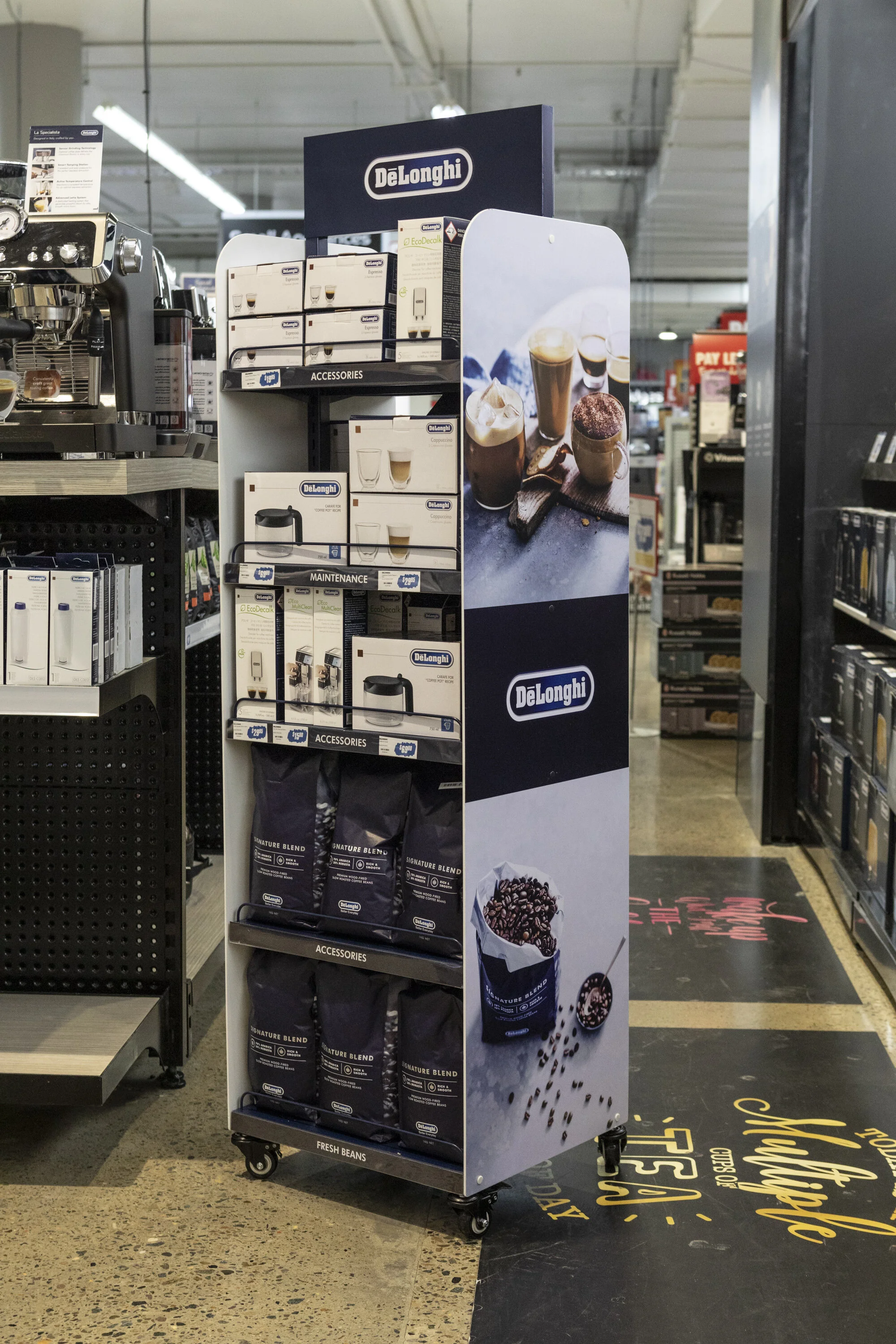
iDesign manufactured the new Delonghi Coffee Accessories Stand to be rolled out to multiple retailers nationwide. We worked closely with Delonghi to produce a high quality display with the following features:
Adjustable shelving to house their full accessories suite and product range
Precise on brand colour match for continuity with all store displays
Curved graphics to complement the logo
Light weight, fitted with wheels for efficient mobility in store
Most effective height for drawing the consumers eye across the store yet not obscuring line of sight
Neat footprint to work in multiple retailers
Flat packed and shipped across Australia to multiple retailers
Manufactured in our factory in Guangdong, iDesign arranged all importation and logistics, and after sales service across Australia.
ELIZABETH ARDEN
Myer Emporium
Elizabeth Arden required a design update for their Myer Emporium space. The display and fixtures would showcase Elizabeth Arden's extensive range of beauty products.
The modular design was scale-able and needed to use infill units which were securely fixed into the existing Myer display fixtures. A 4-way infill gondola system created an effective layout for customer visibility of the products. Hero zones on the endcaps displayed the core sub brands Ceramide, Prevage and 8 Hour.
As a premium brand, high-end finishes and materials were required. Key elements of the design were textured backboards and electroplated gold finishes on shelving and trim. The endcaps have a laser-cut red door logo in edge-lit red acrylic mounted to each side. Rear walls have a woven fabric backing panel with gold trim. The inside bays all use a header lightbox with interchangeable graphics. Tester products locate into acrylic panels above graphic strips.
FLOORCARE
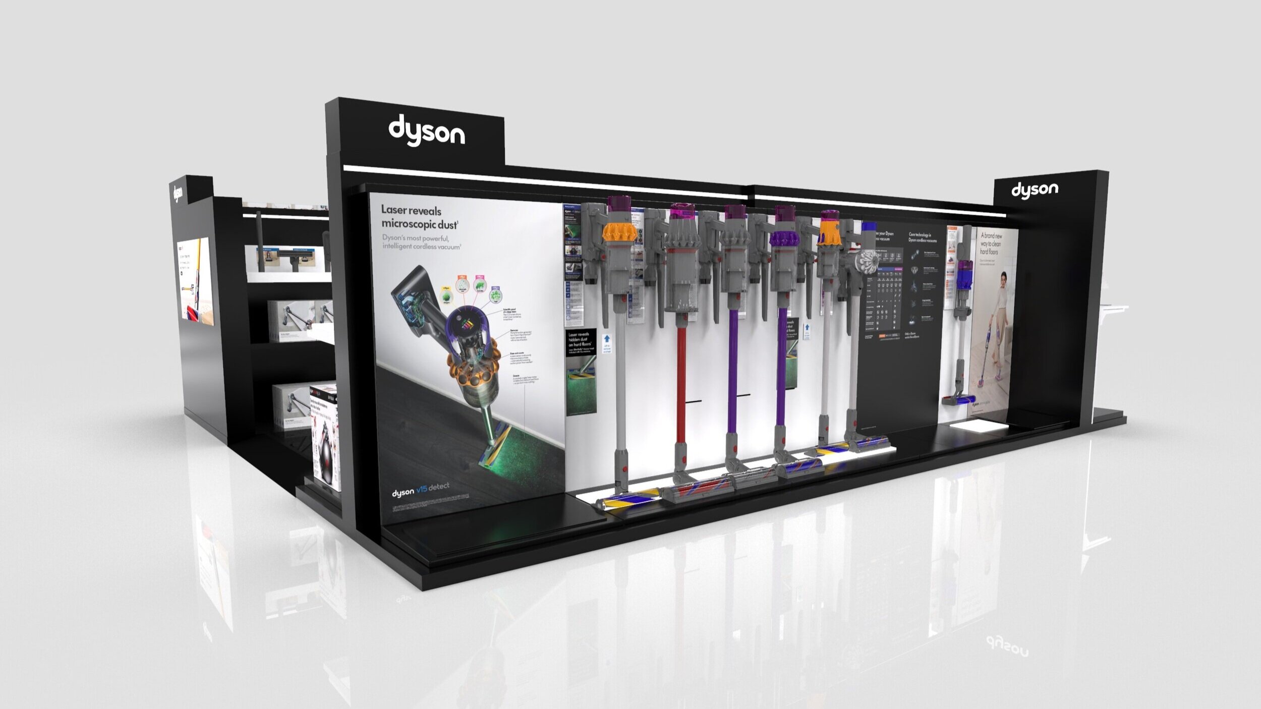
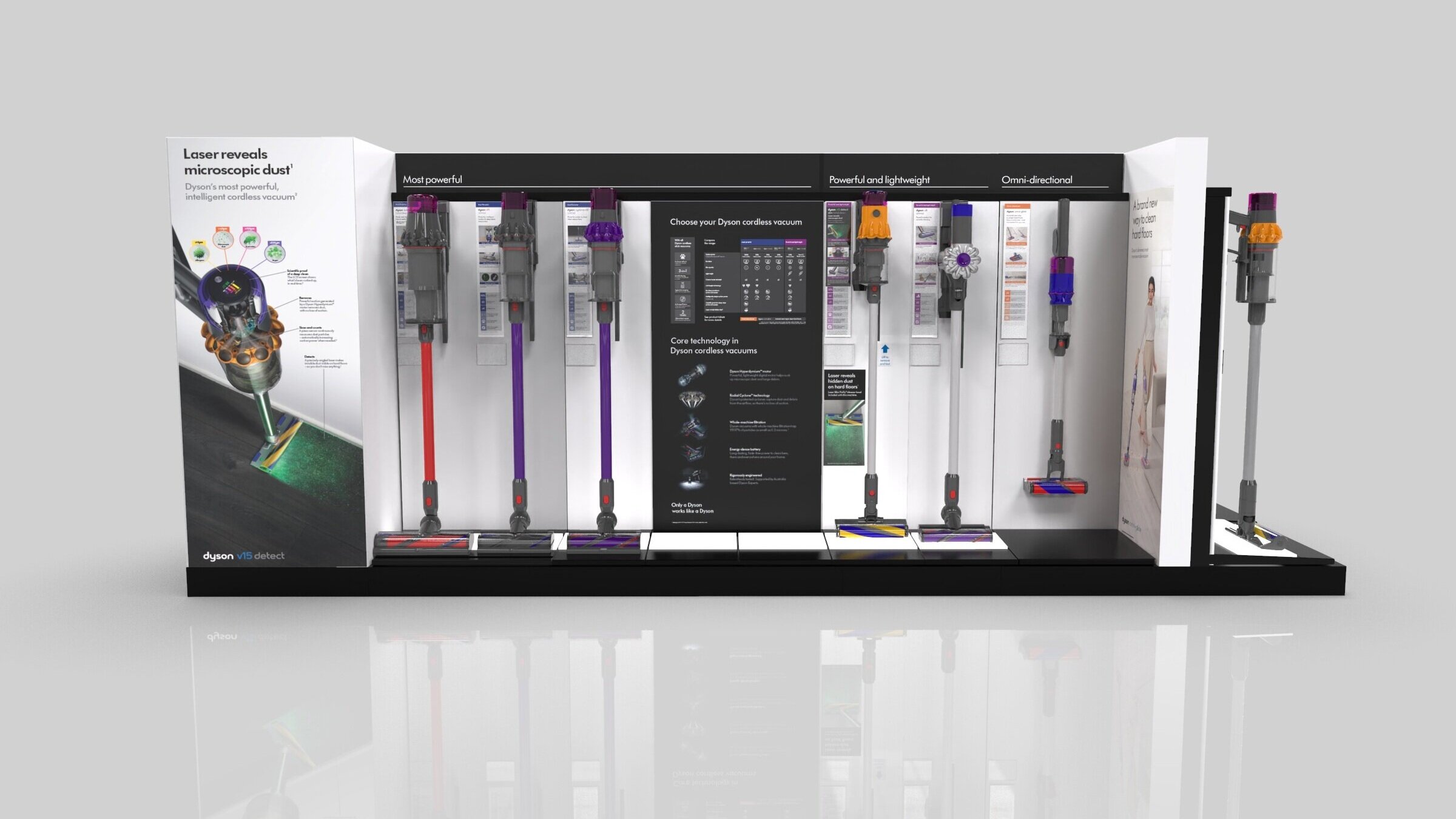
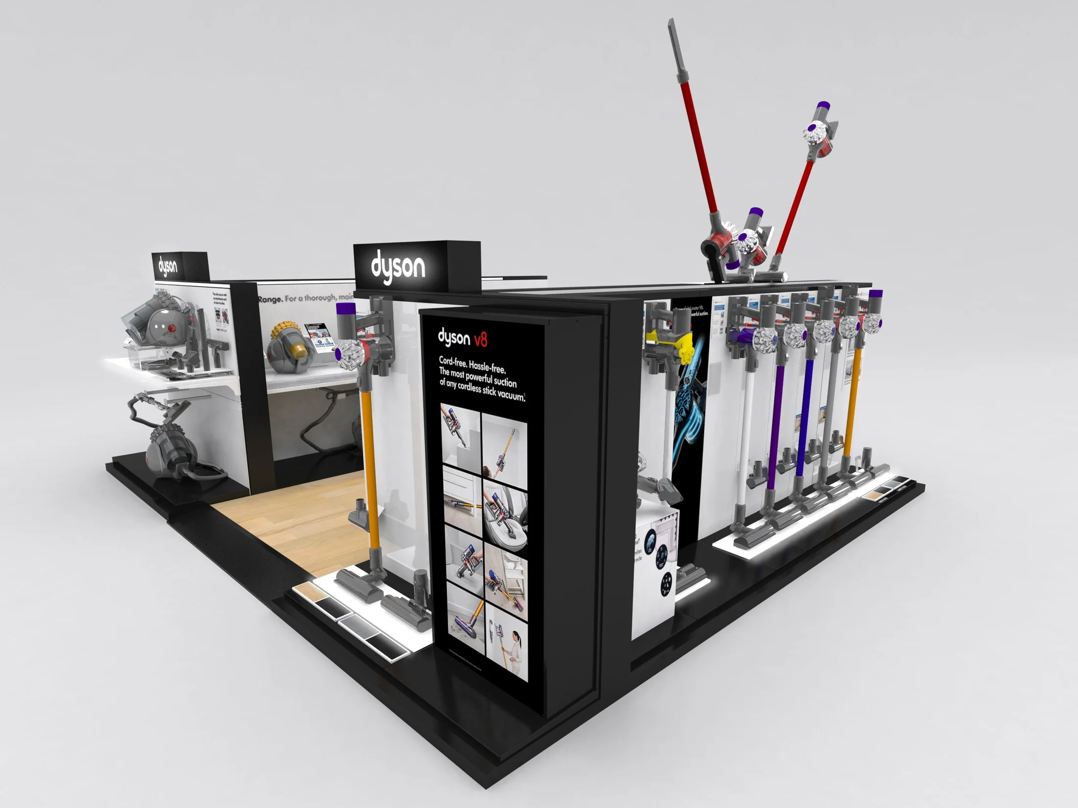
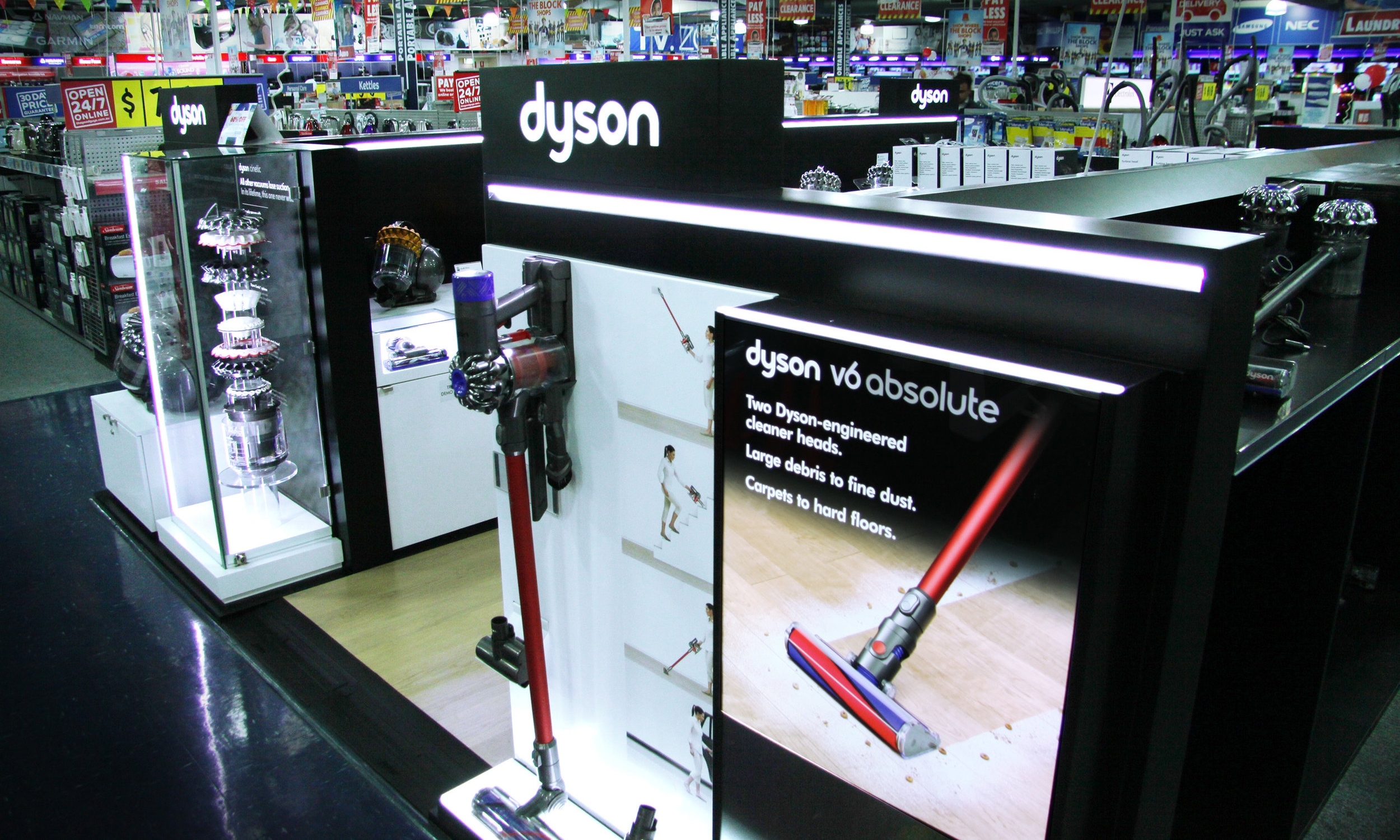
iDesign worked with Dyson Australia to rollout the a yearly Floorcare Update across 5 retailers and 16 types of displays.
THE GOOD GUYS
HARVEY NORMAN
BING LEE
MYER
modular store-in-store
Dyson HQ
iDesign worked with Dyson Global to design and build a modular 50m2 Store in Store area for showcasing and demonstrating examples across the Dyson range. The design required raised flooring tiles to be laid over a heritage protected concrete floor. A large rear wall with a 65 inch TV mounted into the front side and a full rear illuminated back wall, this area showcases the latest handstick range, with demonstration carpet area. It included ten modular adaptable plinths with pull out drawers housing demonstration units, including a “Supersonic” podium for hairstyling and a mobile IPAD display. This became the core design of the national rollout throughout Australia where layouts were made to suit different sized retailers and spaces.
WOW Display V8 Update
iDesign designed and manufactured these displays, project managing the installation in 400+ stores within a 2 week period in peak season.
Pixalux® structural light panels were used to highlight the Dyson range. This was very successful with all products, drawing attention to key areas across the product range.
Results included a 36% sales uplift over the promotional period with continued sales growth averaging 22% since installation. Feedback has credited the sales increase to the demonstration area, and brand visibility and location within the store.
"iDesign is one of the best companies that I have ever dealt with from a creativity and 'on brand' perspective. They understood Dyson as if they were a part of it, living and breathing Dyson and from a work scheduling perspective were always able to quickly scale up and down as we required more resources to maintain our workload."
- Thi Tran - Ex Trade Marketing Manager Dyson Appliances Aust/NZ -
V6 Retail display - modular design
iDesign designed and manufactured displays across a range of retailers, each with specific in-store guidelines. Pixalux® structural light panels were used to highlight the Dyson range. This was very successful with all products, drawing attention to key areas across the product range.
iDesign designed and manufactured the displays, project managing the installation in 400+ stores within a 2 week period in peak season.
UNIVERSAL TOTEM
Dyson asked us to design the Universal Totem to be a modular display with the ability to hold the full product range and adapt to any in-store environment. Briefed to hold handsticks only, iDesign came up with a design solution to future proof the unit to showcase all Dyson stock and use the double sided Pixalux® structural light panel as a base panel that could be adapted with a special add on kit to be used as a floating shelf. The design allows multiple units to be aligned to make a larger display, this was a perfect solution allowing Dyson to use the multiple displays for “Pop Up” opportunities and urgent retail solutions. The successful design has ensured multiple rollouts over a 3 year period.
"Any branded business would be very pleased to have Jayben, Claire and the iDesign team as design partners"
Siegfrid Bacani - former Marketing Manager - Fisher & Paykel Australia Pty Ltd
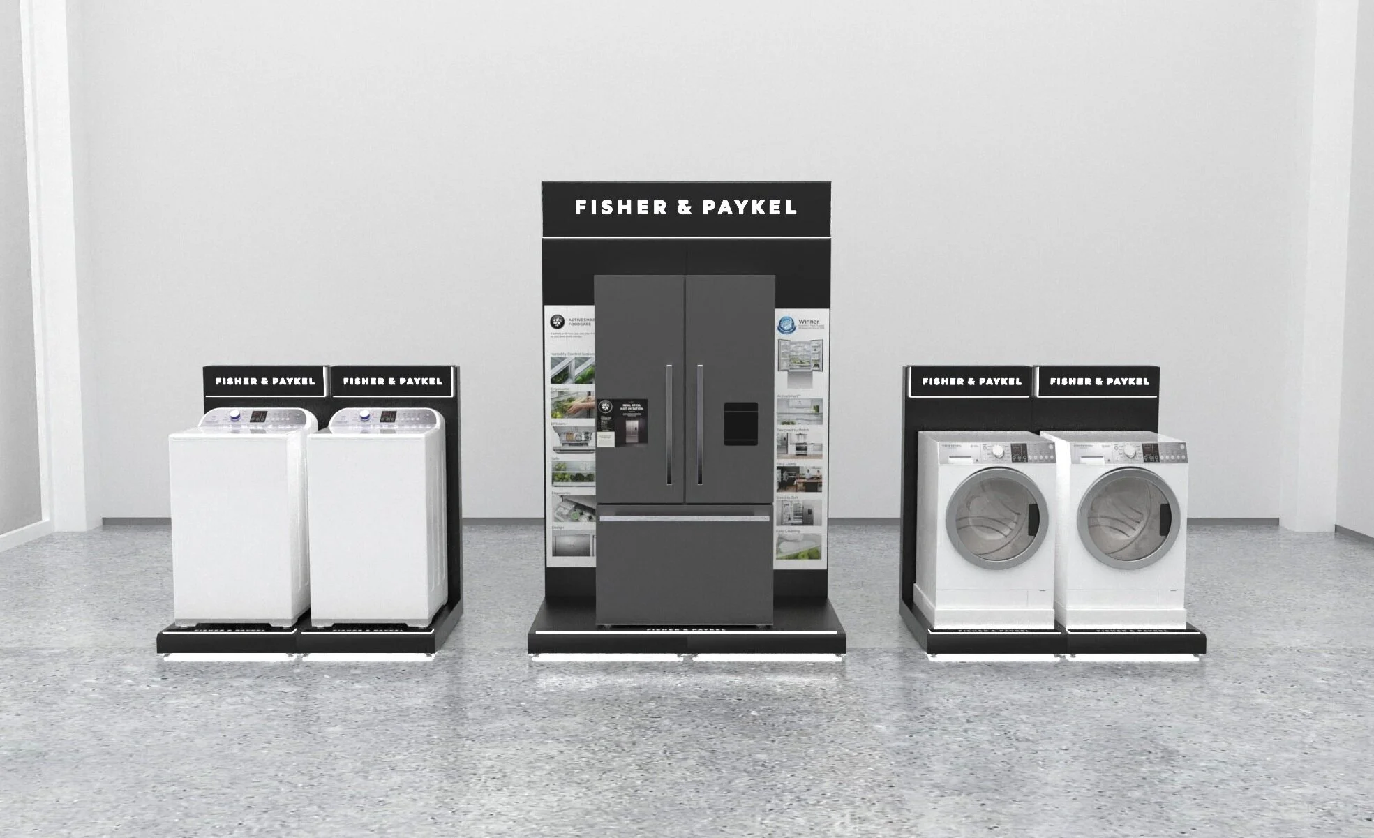
Modular Fridge & Washer Display
Selected Retailers - Australia
There was a need to design a modular system that worked across multiple categories. The design included a sturdy flat packed metalware structure with illuminated Pixalux® structural light panel signage. LED down lighting created a soft halo on the ground, attracting and isolating the display in store. Large magnetic graphic panels were located on the rear back wall. The displays were located on the ends of aisles, driving each category through the innovative design and prominent location. iDesign designed, manufactured, project managed, and installed the displays.
Successful execution of this project has increased sales and brand awareness with a striking lead in display to the categories.
PREMIUM FRIDGE DISPLAY
PREMIUM Washer DISPLAY
GENERIC MODULAR Display
Nationwide
Following the successful launch of the ‘Premium Display’, Fisher and Paykel also created a generic display for the mass market. Suitable for washing machines, dryers and dishwashers this display can be arranged in a number of setups to create single and double end caps as well as entire island areas.
DUAL DISHWashING Display
Selected Retailers - Australia
The challenge - to design and manufacture a display that showcased, and supported the cantilever weight distribution of the current dishwasher range, whist adearing to Fisher & Paykel brand guidelines. The design included a sturdy metalware structure with illuminated Pixalux® structural light panel signage. Benchtop included, area for updatable product information, and interchangeable graphic side panels made from clear acrylic. The unit separated the brand from competitors by using the strong corporate colours and Pixalux® presence, and most importantly solved the common category problem of the unbalanced cantilever weight distribution when the drawers are being opened.
The display was located in selected stores, design, local manufacture, and installation logistics.
shaver shop WALL CABINET 2.0
Australia and New Zealand
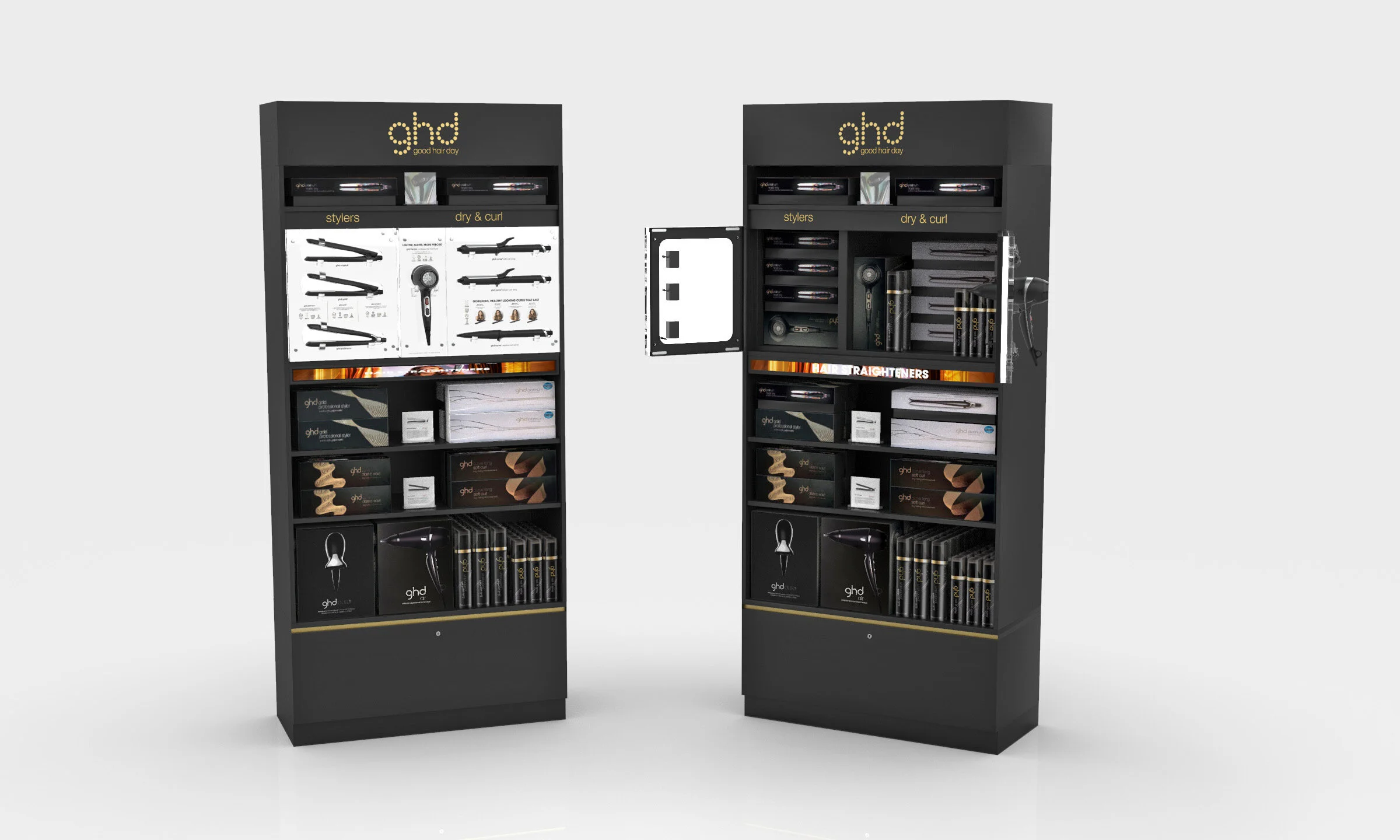
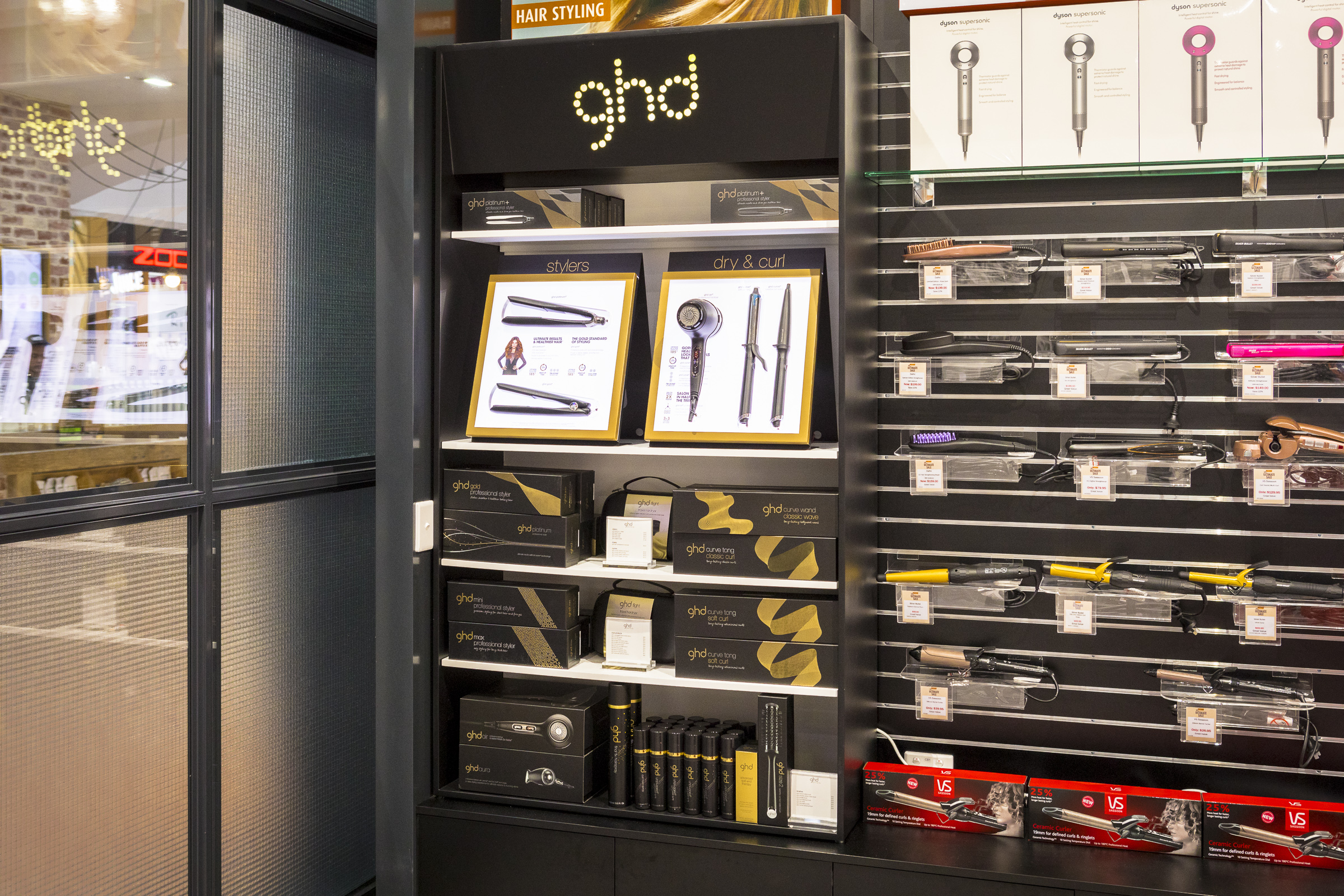
Following a successful roll out of GHD displays nationally, iDesign once again collaborated with Shaver Shop and GHD to create an updated version of its wall cabinet: GHD Shaver Shop 2.0 The design was adapted to create an ‘all in one’ display, ensuring continuity with current in store fixtures. Updating the A Frame areas into a seamless vertical wall area allowed for secure storage behind the hero products, while not interfering with the display products or customer engagement.
The illuminated logo and changeable graphic panels, on our patented Pixalux panelling, created an impactful statement drawing the eye in from front of store. With adjustable shelving, lockable drawers, lighting panels and security cable systems, our design is future proofed for changing seasons and new product launches.
The display has been rolled out across Shaver Shop stores in the ANZ region with fantastic success and return for both GHD and Shaver Shop.
shaver shop WALL CABINET 1.0
Australia and New Zealand
In collaboration with Shaver Shop and GHD, iDesign created a GHD branded Wall Cabinet that houses a range of products including two A frame hero displays.
The cabinet was designed to sit within Shaver Shop store fixtures and on top of the existing cabinetry to allow for a seamless look but a branded GHD area.
A key element to the display was the ability to hold a variety of boxed product as well as tester products in curlers, straighteners and hair dryers. iDesign was able to achieve this through the use of the A frame Pixalux® display.
The cabinet has been rolled out across Shaver Shop stores in Australia and New Zealand with great success and return for both brands.
AIRPORT DUTY FREE DISPLAY
Melbourne Domestic Terminal
GHD engaged iDesign to help them bring the an existing airport stand to life with features that could hold their product and draw traffic to the display.
iDesign created A frames with Pixalux® lighting to display the product, an acrylic box to showcase the hero item, as well as a GHD light logo box to bring branding to the stand. Lighting was also added below each shelf to illuminate the products and create a stronger presence on the store floor.
Through the success of this display GHD and iDesign have rolled out the A frame displays across a number of retailers throughout Australia.
SHAVER SHOP TABLE
Nationwide
For the top tier stores, GHD required a larger, more premium solution to display their range. Our "A-frame" table instantly hit the mark, engaging shoppers, increasing brand awareness and generating sales.
"The ability to truly comprehend a brand personality along with design intent is not easy. When reaching out for a perfect partner to deliver our New Zealand based designers’ vision for Haier, iDesign were the clear stand out. They took it to another level when project managing the job through from manufacture to installation with a best in class approach to communication across more than 100 stakeholders! Exceptional result!"
Kym Porter - Global General Manager - Retail Experience
LAUNDRY DISPLAY
The Good Guys stores across Australia
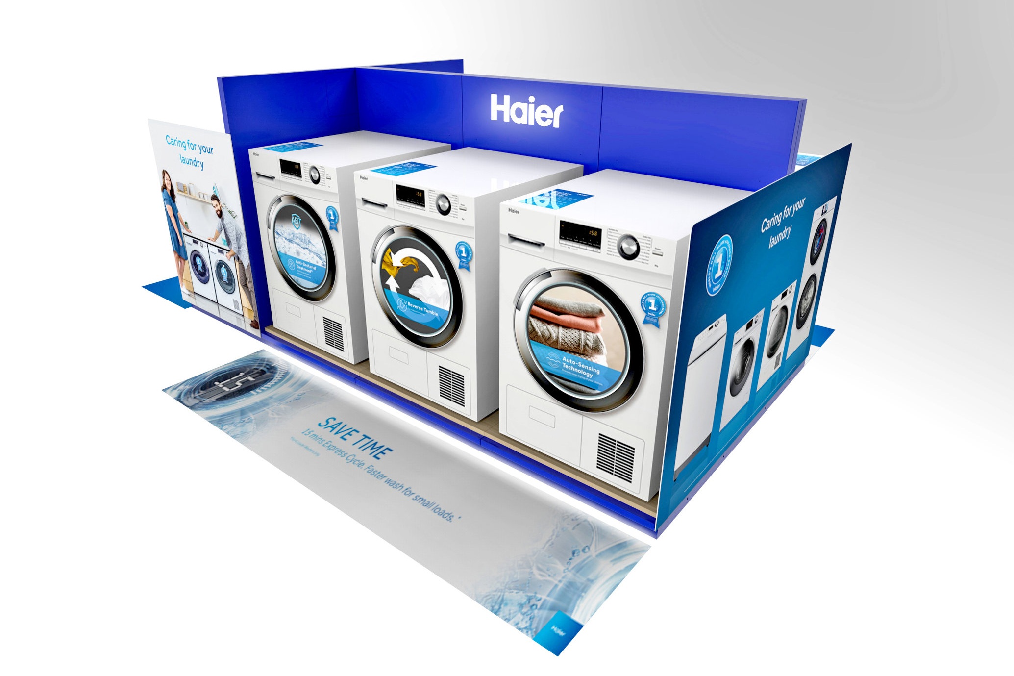
iDesign worked with Haier to create a display that would be rolled out to all The Good Guys stores to expand their retail foot print in store and showcase the Haier front loader and dryer range.
The modular system allowed for flexibility in store and for a smoother installation process, whilst creating the look and feel of a single unit. The LED lighting created a glow to the base and header which increased the presence of the stand in store.
Roll out was across all of The Good Guys stores across Australia over a short period with great success and glowing response from both brand and retailer.
As a result, Haier Laundry now has a permanent home in all The Good Guys stores across Australia and has reached a milestone of greater brand presence in the market as well as increased sales of 58% year on year following the installation.
FRIDGE DISPLAY
Nationwide
Haier, the number one brand of major appliances in the world, briefed iDesign to showcase their new T Series fridge range.
Competitors in store were driving the category with large end caps. Haier required a solution that was on brand, simple to assemble, as well as easy being able to work with multiple sized fridges across the range.
All graphics were inter-changeable in addition to the header and front left display box being illuminated.
National rollout: designed, manufactured, warehoused and installed by iDesign.
Results: Immediately Haier were more prominent and now have the opportunity to own space in store across multiple retailers.
AIR-CONditioning WALL
Air-conditioning distributors across Australia
iDesign Group worked with Haier and the Air-conditioning team to create a 3-bay wall display that showcased both indoor and outdoor units.
With varying retail space sizes, iDesign was able to create a design that was compact enough to fit in all required wall spaces and also showcase a variety of product while staying true to the Haier branding look and feel.
The roll out of the units went across Australia into Haier air-conditioning distributors, creating a greater presence for the brand and category.
Custom 2.5m high Display
SINGLE BAY AIRCONDITIONING WALL DISPLAY
Nationwide
Following the success of the Three Bay Air Conditioner Display, Haier approached iDesign to create another display that was compact enough to allow for more distributors and retailers to be able to accommodate a Haier branded display with their store.
iDesign created the single wall bay display that was able to accommodate both an indoor and an outdoor unit as well as a TV screen to showcase the capabilities of the range.
The units have been successfully installed throughout Australia and have the flexibility for the range to be updated if and when required.
TWIN TASKER DISPLAY
Nationwide
Haier briefed us to showcase their innovative new Twin Tasker Dual Load Washer to the Australasian market. Designed in two sizes for end caps in multiple retailers, but suitable as a stand-alone fixture when required, the clever solution showed an LED illuminated acrylic representation of twin tubs on one side, and key information/branding panels around the display, highlighting key messaging in 360 degrees.
The use of Pixalux® light panels for signage, header and base, allowed illumination to key areas on the display. A soft white halo of LED down lighting under the base drew attention and grounded the display. The metalware structure came fully assembled with minimal installation required onsite ensuring non disruption over the busy Christmas period.
JOSEPH & JOSEPH LAUNDRY DISPLAY
Nationwide
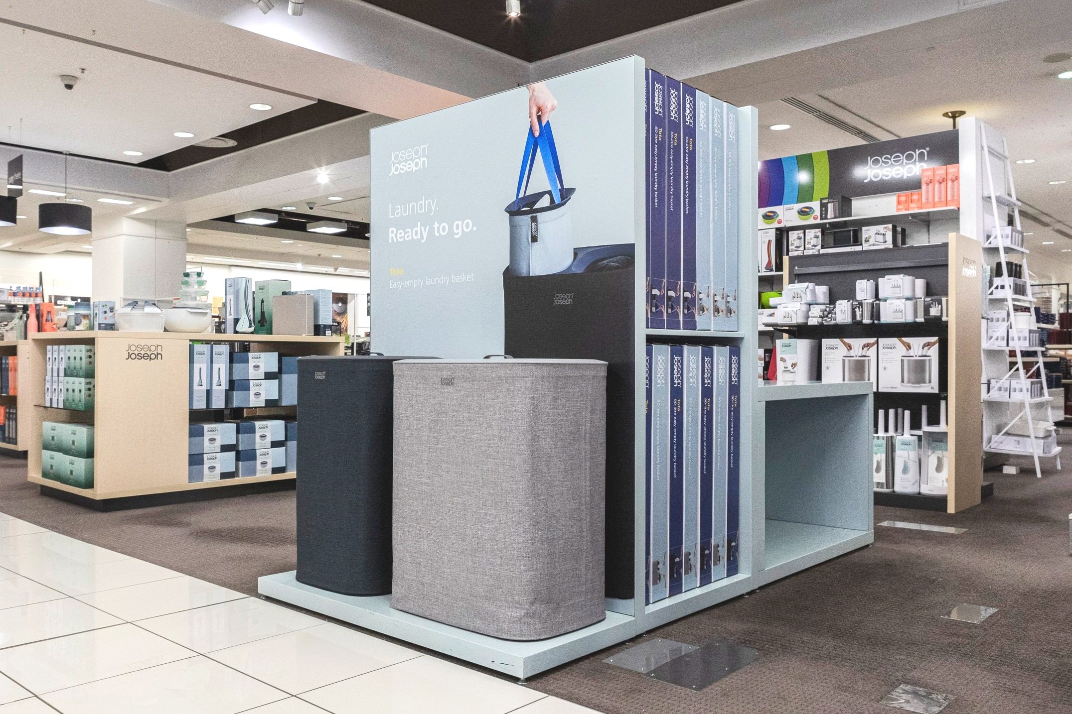
Innovative household accessories brand JOESPH & JOSEPH tasked us with designing a new modular laundry display to be used across different retailers. With a short turn around time we did what we do best and engineered, delivered and installed on time and budget.
Nice job everyone.
JOSEPH & JOSEPH SHOP-IN-SHOP
Chatswood
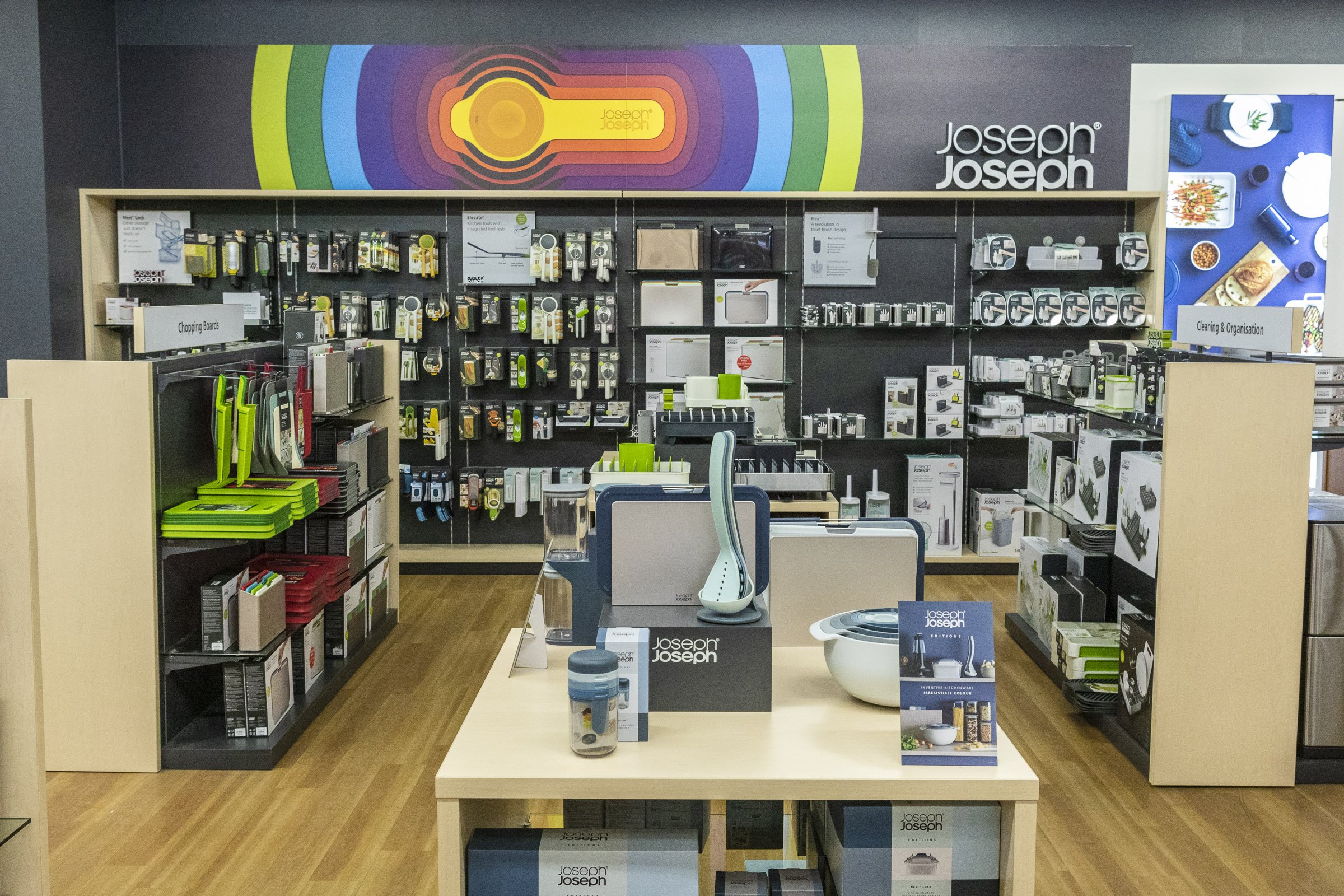
On the back of our successful Laundry Display roll out we also produced several full shop-in-shop displays for our client. Plinths, racking, lightboxes and all. That’s how we like our kitchen utensils; neat and tidy.
JOSEPH & JOSEPH MYER
SYDNEY CBD
TIMBER BENCH
Harvey Norman
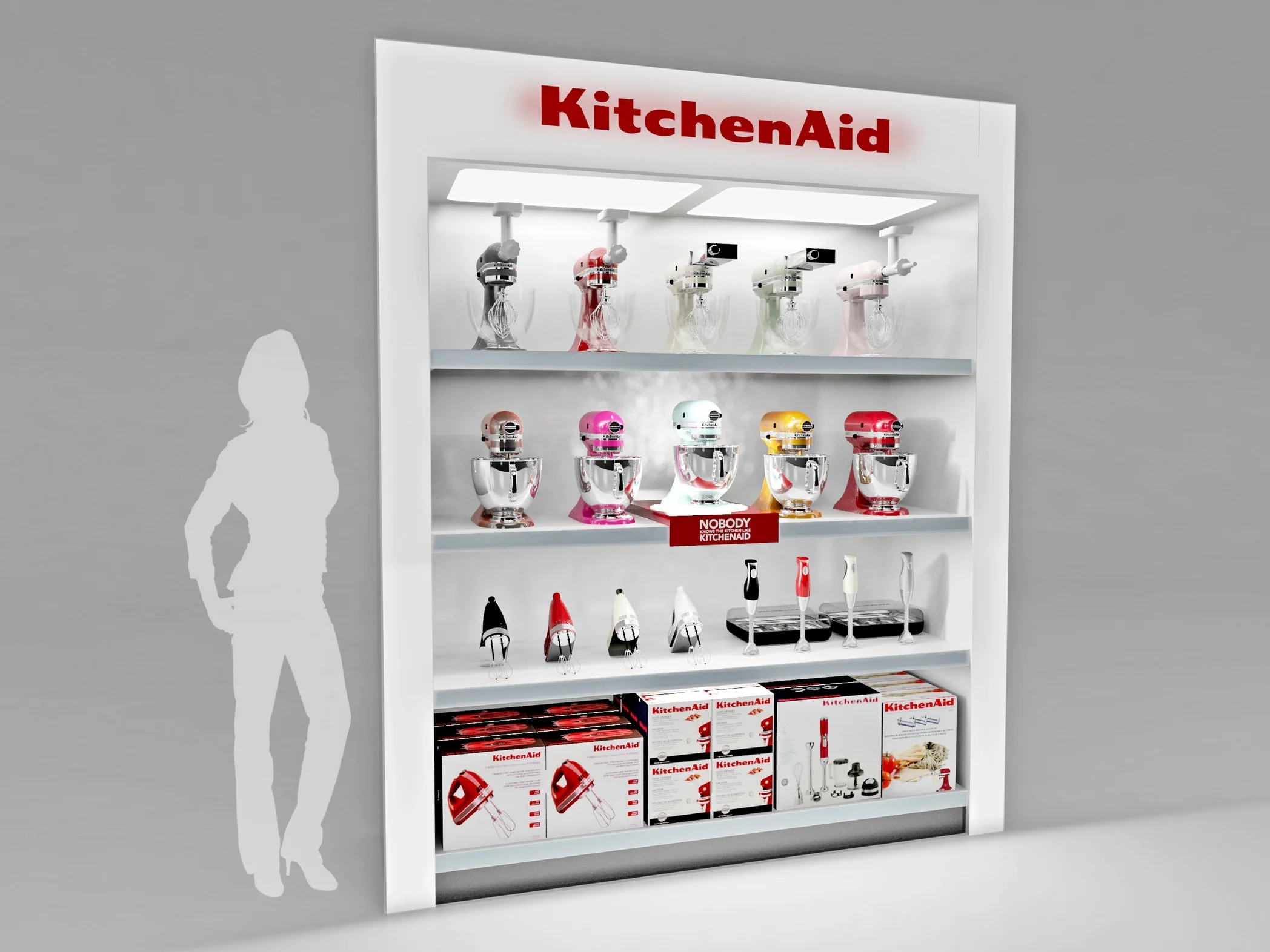
iDesign’s latest project with KitchenAid included designing and producing a modern timber bench to promote the standmixer range at Harvey Norman. The design was to follow the new global design guidelines and to achieve a premium look and feel. For this project iDesign liaised with local specialists in Australia and delivered this beautiful centre piece.
TIMBER END CAP
Harvey Norman
In conjunction with the timber bench iDesign also designed an end cap for the KitchenAid breakfast range. With illuminated logo, adjustable shelf and updateable side graphics, this new end cap adds another piece to KitchenAids transition to the new global design.
CULINARY CENTER FOR PREMIUM RETAILERS
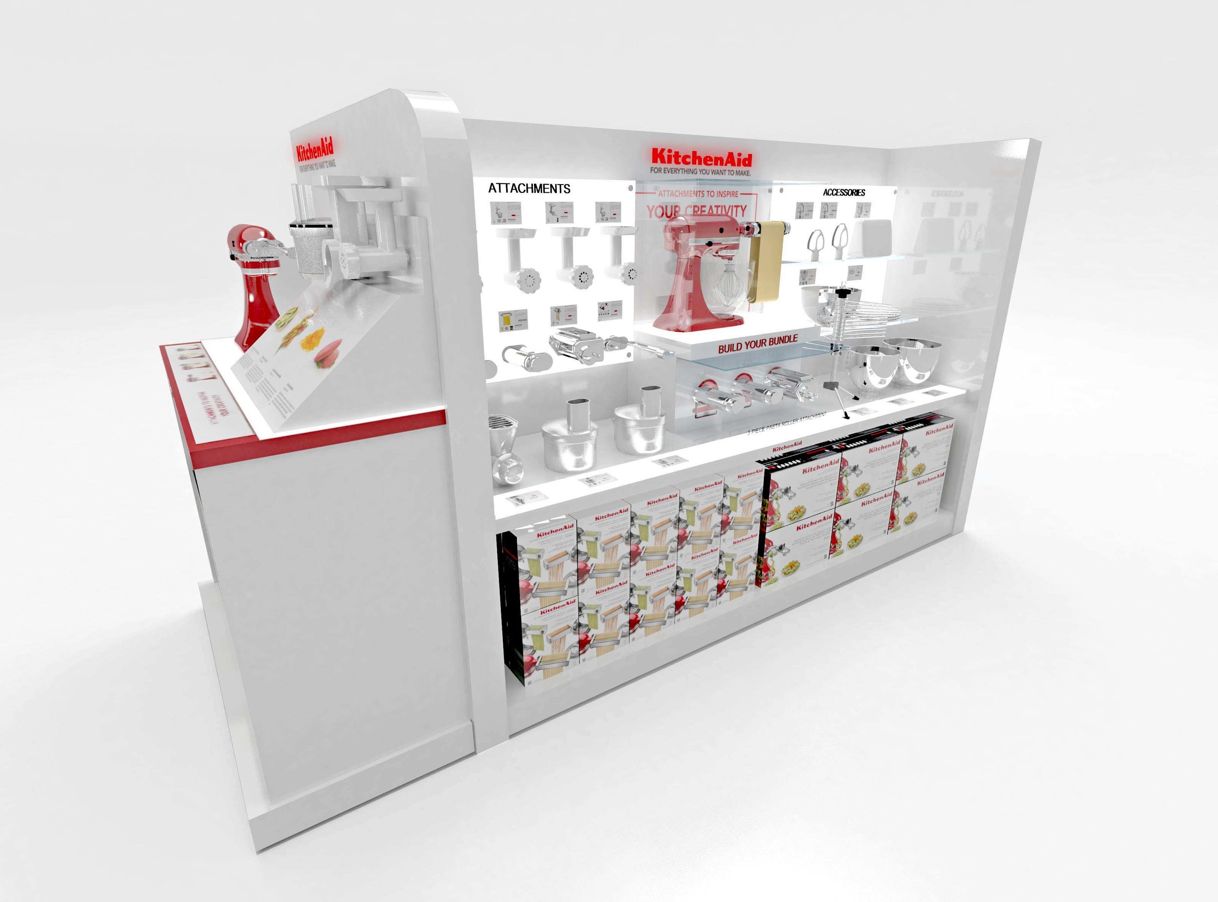
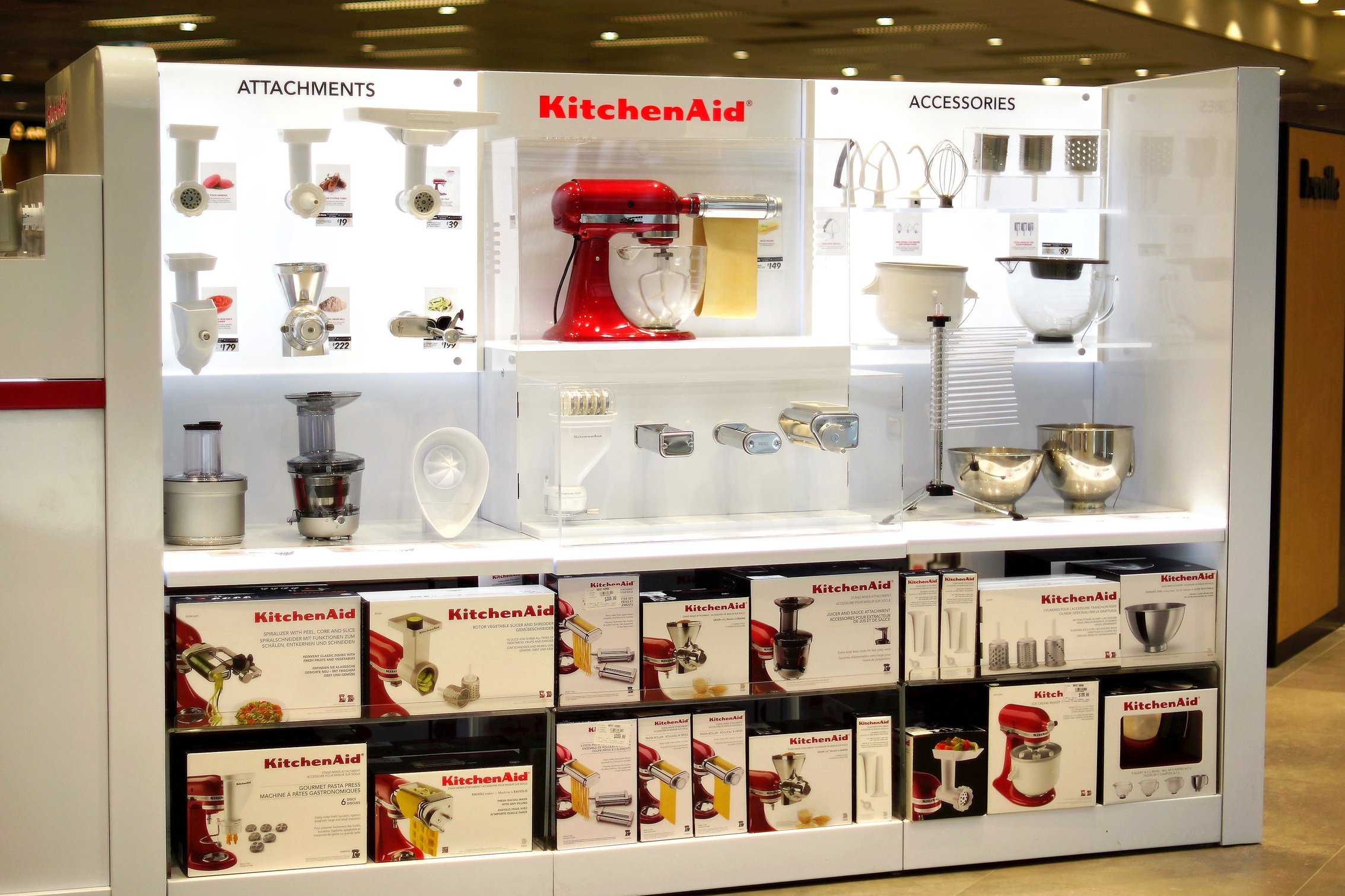
iDesign worked closely with KitchenAid to design the new Culinary Shop in Shop Display to generate sales through accessorising the current 300,000 KitchenAid mixers owned in the Australian market. The design required an area to display mixers on one side, with accessories and attachments on the other side. The endcap showed the accessories story with mixer and attachments with graphics. The rear end had an interactive 55 inch digital screen for surfing product through an in store web based platform linking to the KitchenAid website.
A metalware display with eye catching illuminated Pixalux® light panels featured along all shelf front edges and wall panels. The hero of the display is a fully functioning mixer activated by a motion sensor,.
Strong sales and the interactive nature of the display has ensured success in store, and aligns with brand strategy for 2017-18.
ACCESSORIES SIDE
ATTACHMENT DISPLAY
END CAP
MIXER SIDE
"I rarely endorse agencies but iDesign has been a stand out. They frequently go over and above to deliver, no matter how tight the deadline or ambiguous the scope of work."
Richard Babekuhl - former Marketing Director KitchenAid Australia
Island display
Australia and New Zealand
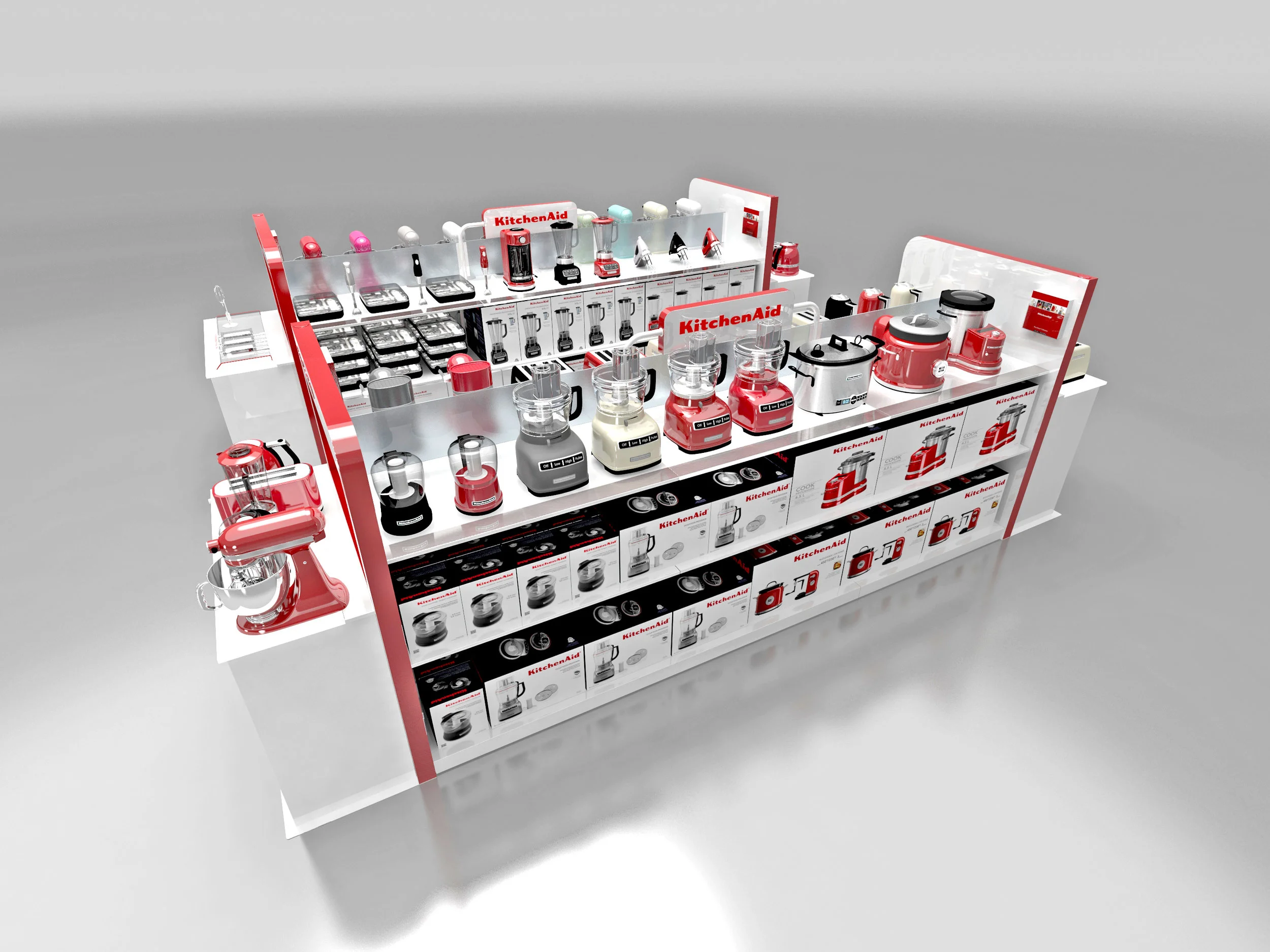
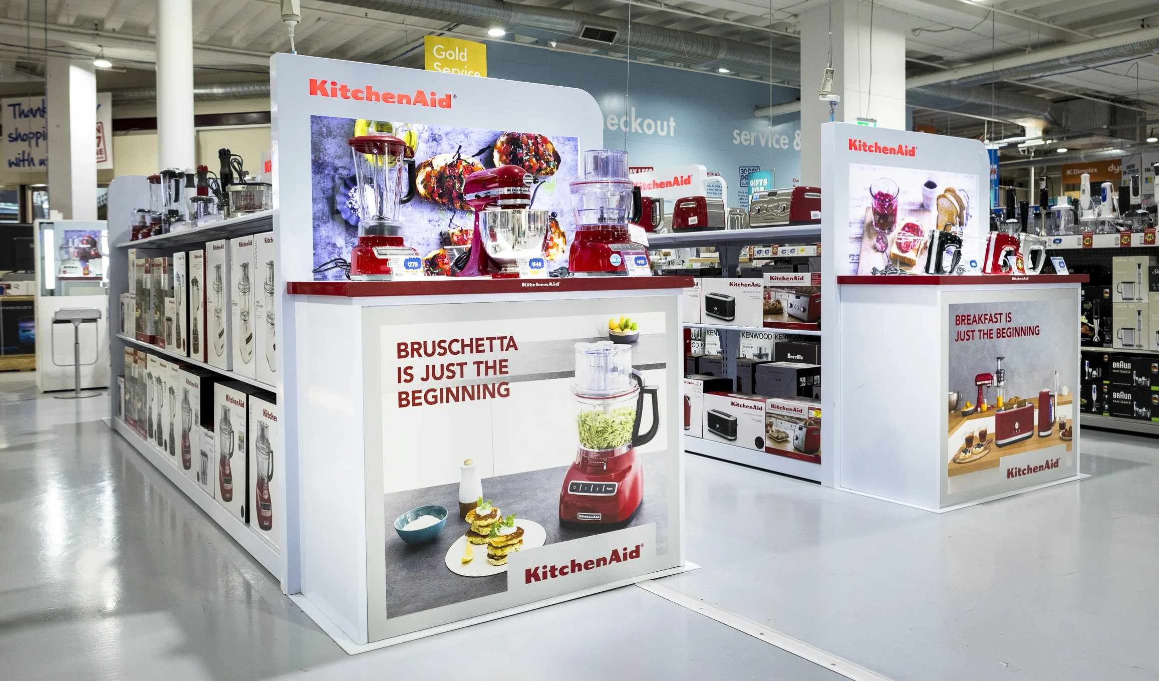
One of the core strategies for 2017 was growing the KitchenAid brand within major retailers in Australia. An opportunity to secure space in the highly sought after Kitchenware electrical goods category required a free standing table area for demonstration units and boxed stock. Adhering to global brand design standards, saw the displays adapted from a standard wooden design to a premium display in metal.
iDesign - designed, manufactured and installed the displays throughout Australia.
WALL BAY
Australia and New Zealand
Instore KitchenAid wall displays were tired and not working. iDesign were engaged to find a solution to bring the area “back on brand”. A key requirement was to have a neutral shelving solution to allow maximum product range to be shown. iDesign - designed, manufactured and installed the displays across Australia. Retrofitting a modular flat packed shelving system into an existing cavity required precise engineering and a self-supporting structure able to hold over 200kgs of product weight. The 120mm Pixalux® light panels across the front edge of shelves provided ample down lighting into the cavity and also from the 3x header panels.
iDesign manufactured this locally in Australia and managed installation and logistics throughout all Australian states and selected NZ retailers
iDesign designed, manufactured, project managed
and installed nationwide.
Complete Store in Store
Nationwide
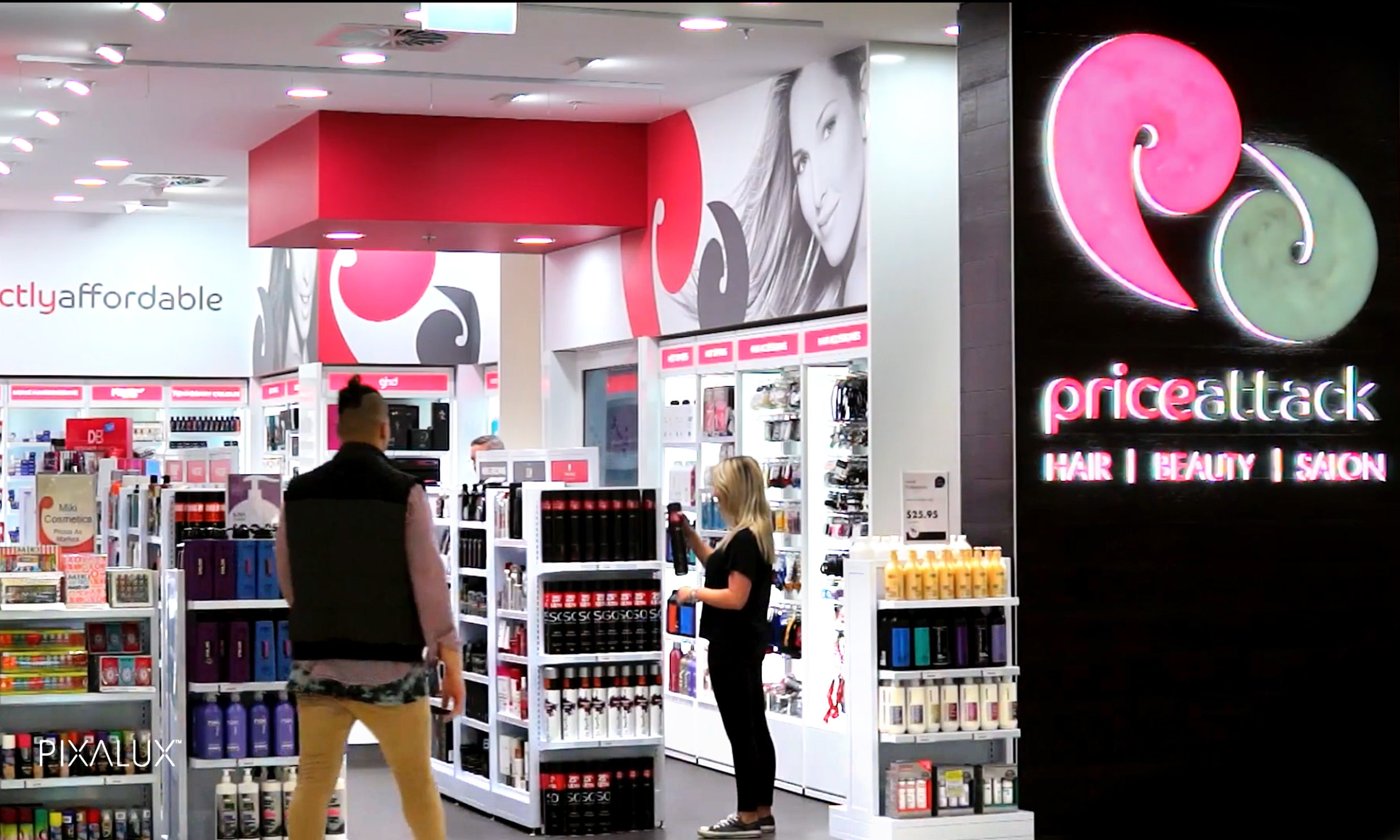
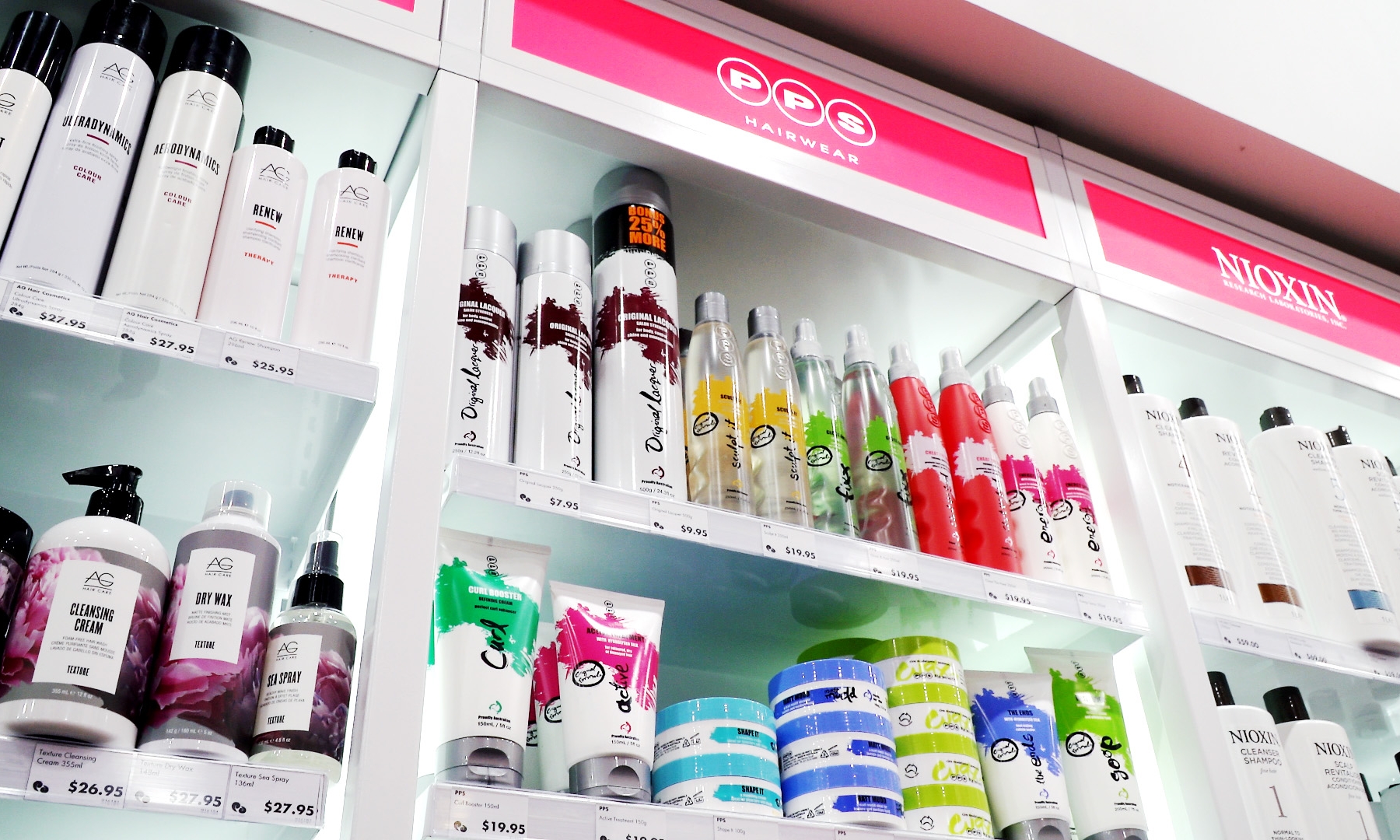
iDesign designed the Price Attack store design as an integrated modular shelving system for the Price Attack store range throughout Australia. We used the double sided Pixalux® structural light panel to separate bays with an illuminated divider, and a magnetic illuminated header and shelving system. The easily updatable design was flat packed to allow quick 1-2 person installation and reduced shipping costs.
The typical store layout would have 16-24 wall bays (either 600mm or 900mm wide), 2 - 3 mobile promotional units, and multiple freestanding floor gondola displays.
Manufactured in China, iDesign arranged all importation and installation logistics, and after sales service across Australia.
Complete Store in Store
Nationwide
iDesign is engaged in full CAD engineering and project management of interior signage and lighting systems within all Priceline stores in the ongoing upgrade to current and all future stores over a 5 year period.
The solution used direct printed Pixalux® structural light panels to highlight categories instore, and illuminate panels around the store entrance. iDesign supplied and installed all signage with the magenta and green coloured lighting projected onto the rear walls behind wall shelving to help enhance atmosphere and mood within the store environment.
"With a comparative sales increase of 75% we allowed shoppers to purchase the total outfit needs for each occasion."
as advised by Myer Melbourne
RANSAL - MEN's ACCESSORIES SHOP IN SHOP
Melbourne
The client was concerned that accessories were scattered and disjointed within the men’s accessory category. There was no coordination within the men’s department to guide the consumer on how to accessorise every component of men’s fashion. Our task was to create an environment that clearly explained how to combine accessories to match the occasions of formal, elevated casual and casual events.
With a comparative sales increase of 75% we facilitated shoppers in their purchase of the total outfit needs for each occasion. Myer has advised that this has been the best instore execution in years.
CHemist warehouse ultra
REVLON AUSTRALIA
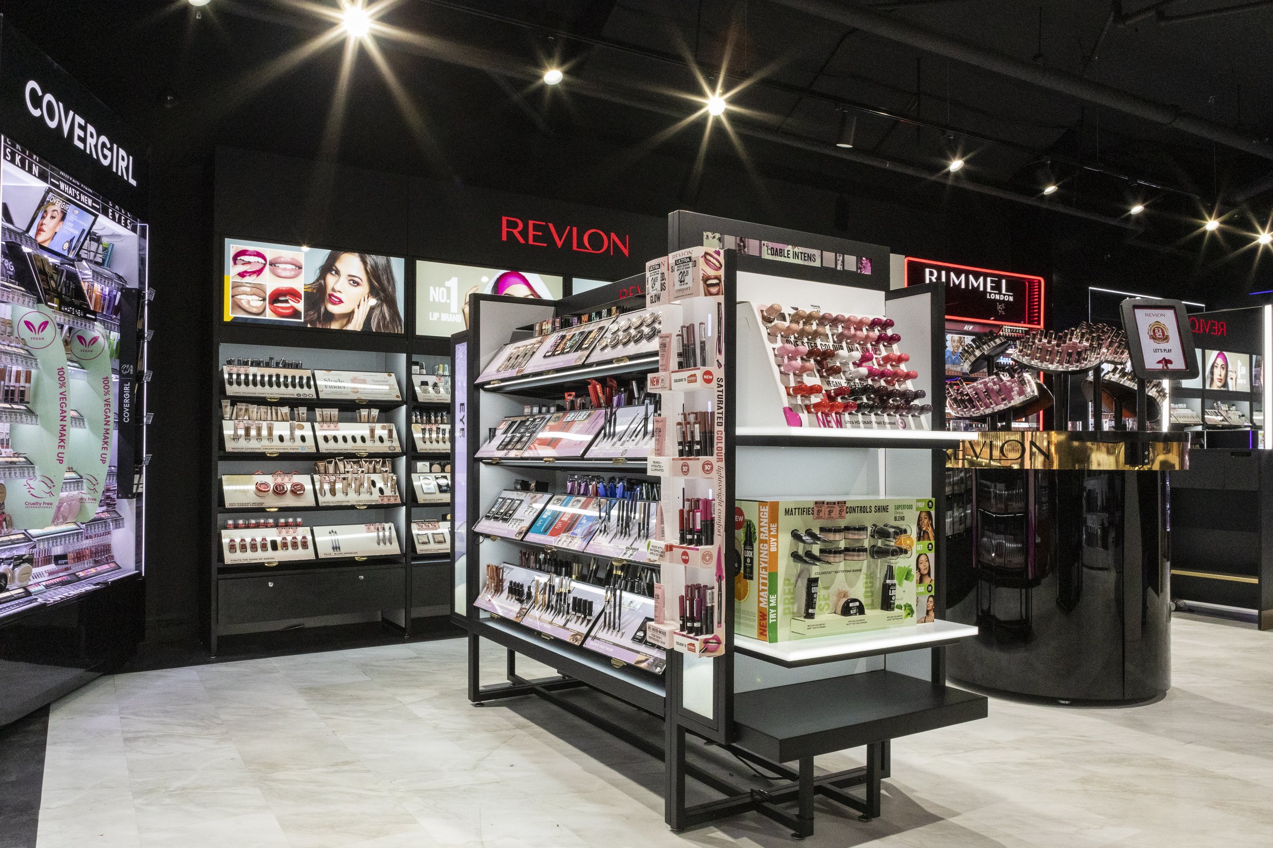
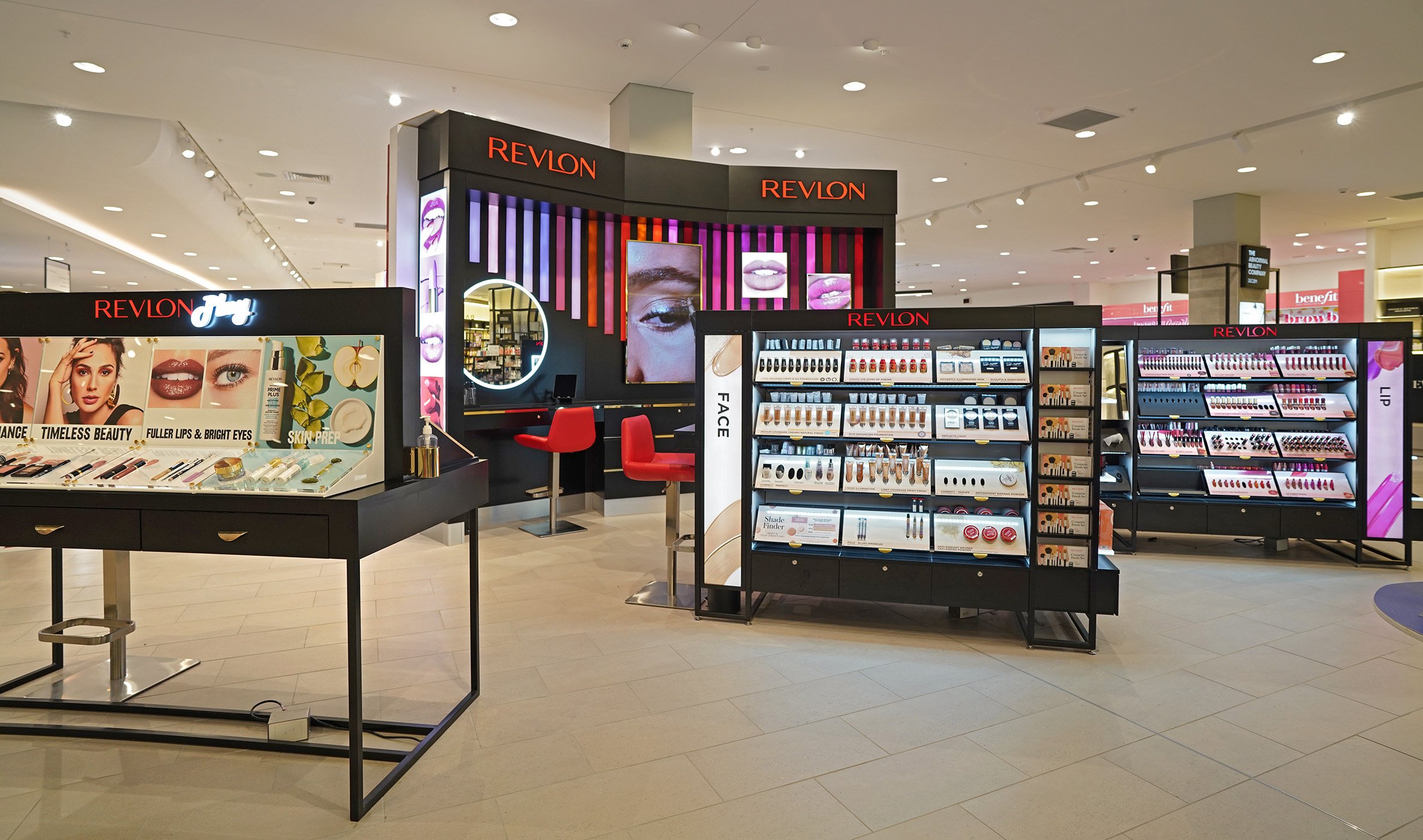
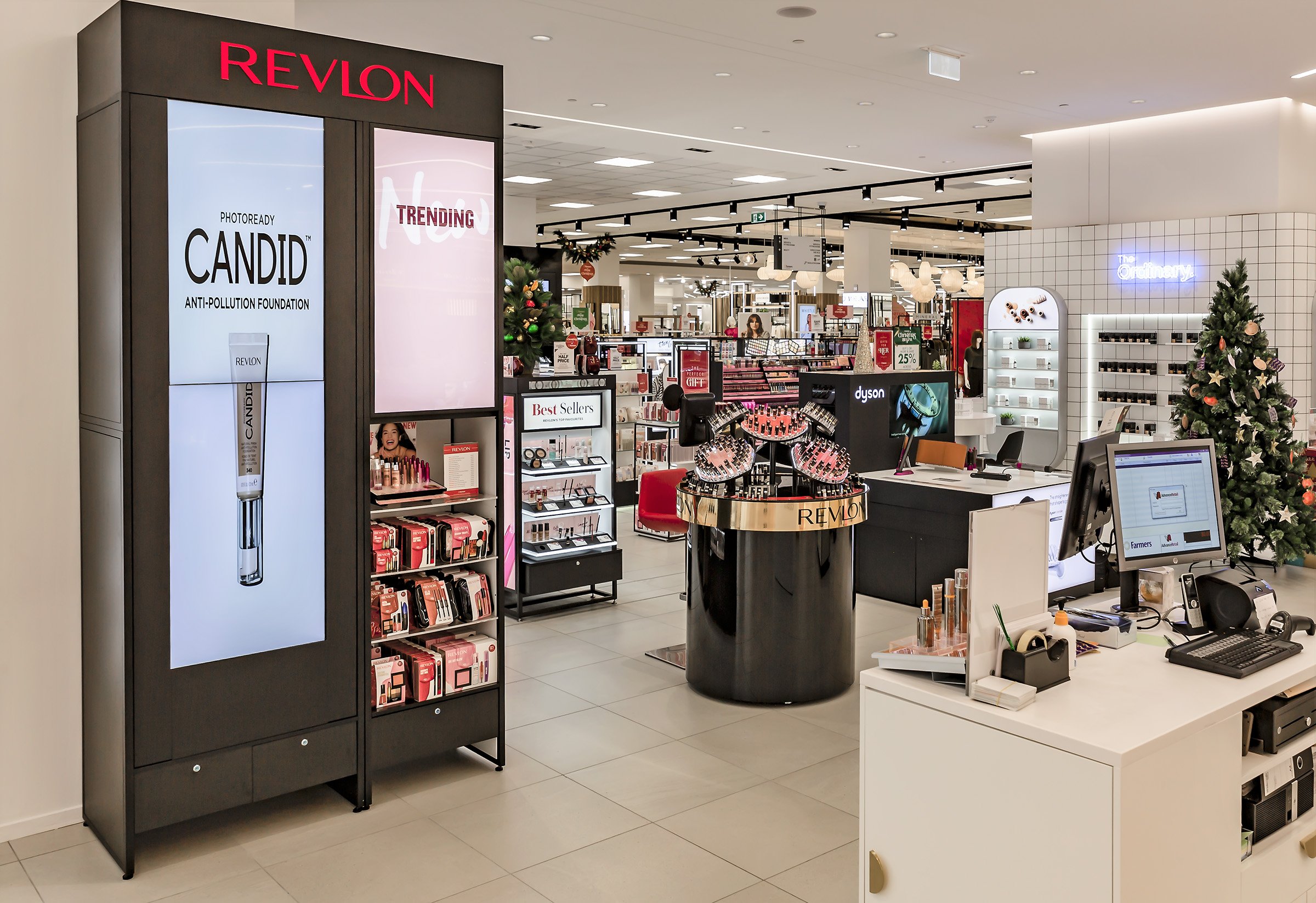
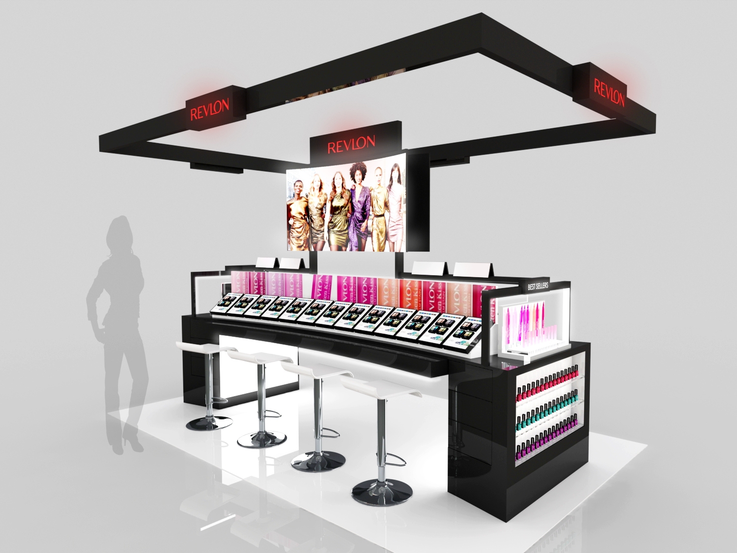
We are very excited to be a part of Revlon’s inauguration to the new Chemist Warehouse Ultra stores. Bigger, better and most of all: shinier. Combining our Revlon mid tier gondola with 4 brand new, store specific wall bays and the brand’s own lip spinner, we really feel we’ve made Revlon look ultra good.
MYER KARRINYUP
REVLON AUSTRALIA
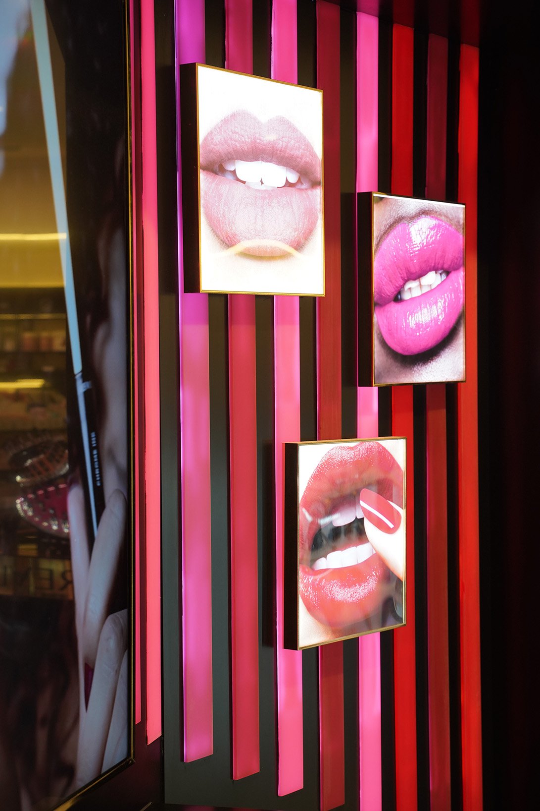
We are quite proud of the feature wall we were able to create for Revlon’s space at MYER Karrinyup. This is a real eyecatcher with the extra large beauty mirror, the big screen and the 26 slats of backlit resin. Supported by a custom design play table and our proven gondolas with 24 product drawers each, we definitely put our client center stage.
FARMERS SYLVIA PARK
REVLON NEW ZEALAND
Another successful Shop-in-Shop for Farmers New Zealand.
MYER MELBOURNE and MYER CHADSTONE
REVLON AUSTRALIA
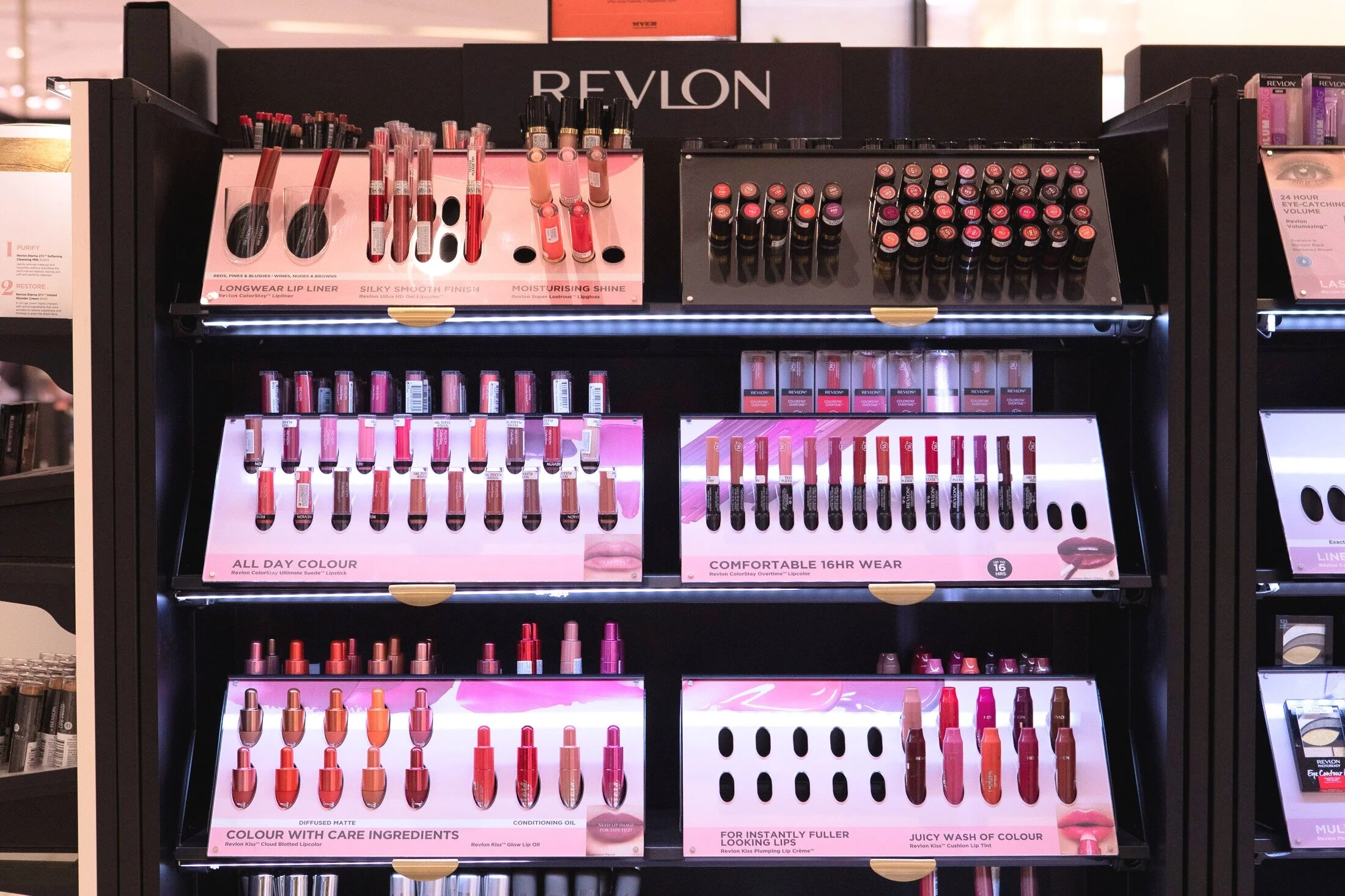
The iDesign Group worked closely with Revlon ANZ to create a new vision for their premium retail spaces. Initially rolled out in Myer Emporium Melbourne, this premium looking drawer system, focuses as much on its looks as it does on its modularity and shopability.
Based on 4 single drop-in bays our design as delivered pre-installed and was setup within one mornign before trade. All the drawer front can easily be interchanged and updated with a new planogram. Revlon as well as MYER were very pleased with the final result and this design has now become the foundation for the the new Revlon pharmacy walls as well.
MYER MELBOURNE
MYER CHADSTONE
Watsons Cosmetic DisplaY - PHILIPPINES
REVLON USA
Revlon engaged iDesign to produce a “next generation” design, in the newly secured cosmetic retail space for a major Philippines retailer. Working closely with the Revlon US team we turned around the conceptual, and engineering design within a tight timeframe.
Key design considerations for the design included – brand awareness, modularity and freight, staff interaction, cost economy, assembly on site, navigation and illumination, and visibility in store. The unit was manufactured using a steel frame substructure, back to back mounted 65 inch high definition TVs, swivel mirror system, product testing tiles with storage, and functional endcaps. Premium finishes were required using stainless steel, and 2 Pac paint finish in high gloss on all cabinets and drawer system.
TAYLORMADE - GOLF FITTING CART JAPAN
Japan
On the back of our successful roll out of the first Fitting Cart we were contacted by Taylormade Japan. They really liked what we had done but had a few specific requirements in their retail environment which required a further development of our initial design.
The main points of this new brief were: Less club and shaft stock, smaller footprint, a fold-out table for a note pad and a more lightweight look and feel with open drawers behind an acrylic door. Working closely with the client through a few rounds of refining our concept we were able to create a great solution to not only met our clients needs but also looked really great.
"It's got a really good feel and a really good functionality which really suits our brand."
Darryn Lowe - Product & Experiential Manager - Taylormade Adidas Golf
TAYLORMADE - GOLF FITTING CART AUSTRALIA
Nationwide
Working closely with Taylormade and Pro Shop staff, iDesign researched, designed and manufactured an Australia wide rollout of the NEW Taylormade fitting cart. The cart was required to showcase the complete range of club heads and shafts. These had to be easily accessed, when inside the pro shop or moved to the driving range for fitting and testing of clubs.
Critical to the design was weight and mobility, and the ability to be easily accessed, and moved onsite to the driving range for fitting and testing of clubs. Key features include: mobility, and ease of movement by one person, mild steel construction with nine pull out drawers lined with EPA die cut foam inserts, graphic areas, a rubber IPAD work area, a wheel system and exterior bolt on shaft brackets.
Manufactured in China, iDesign co-ordinated logistics to work closely with Taylormade on delivery to all premium and mid-tier Talyormade distributors throughout Australia.
Feedback has been very positive with design additions for US and European markets.
TAYLORMADE - STORE IN STORE
Australia and New Zealand
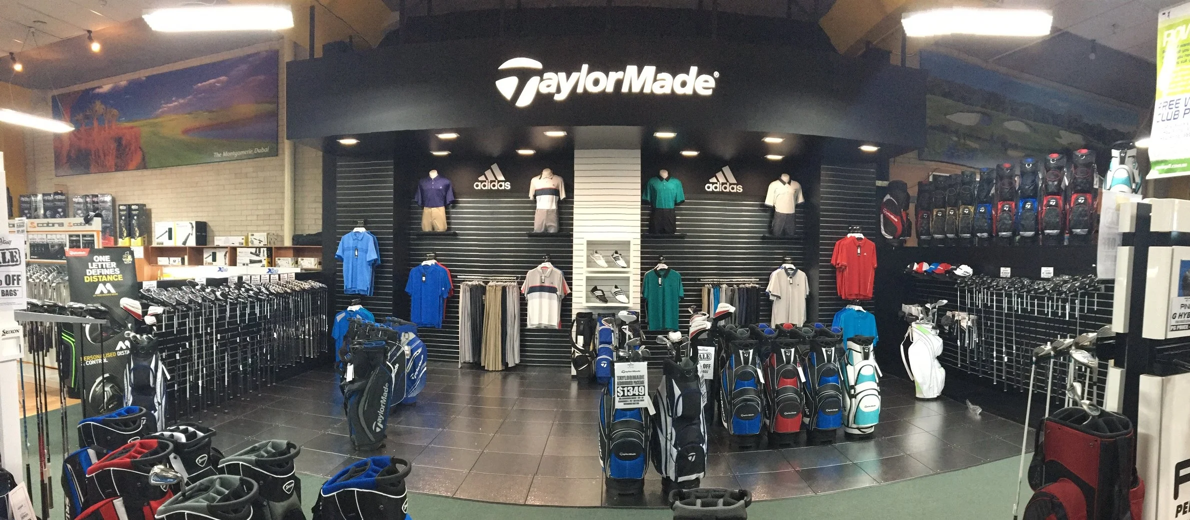
Taylormade Store in Store areas required a facelift to bring in line with new brand guidelines, and make a more functional space with the ever expanding product range. As the brand is seen as a market leader, it was important to dominate instore and to allow the shopper to interact with Taylormade products including, clothing, clubs, bags, and shoe range. Each store was bespoke and required a different Suite of elements that were used throughout the changeover. The use of illuminated Pixalux® structural light panels were used to focus attention in key areas, and separated categories. IDesign designed, manufactured and project managed all the installations across multiple states in Australia and New Zealand.
Complete Store in StorE
Canada and Australia
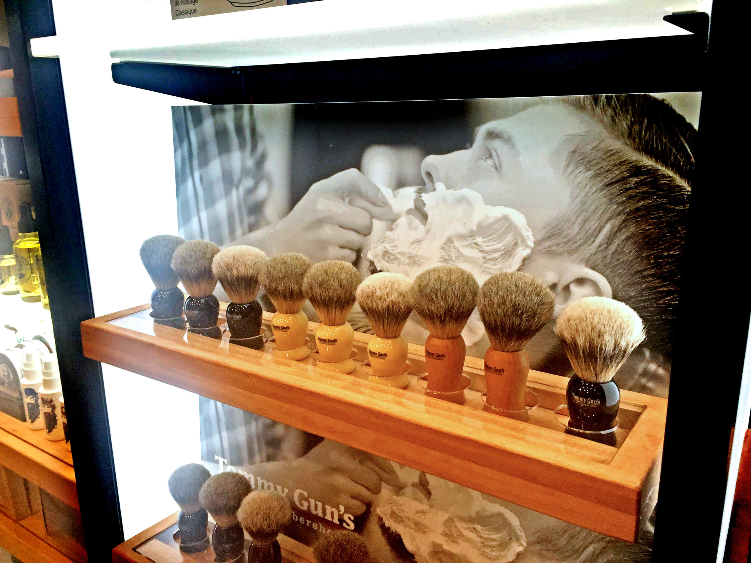
iDesign designed the Tommy Gun's store design as an all in one modular shelving system to increase sales and brand awareness for the Tommy Gun's Canadian and Australian store networks. We used the double sided Pixalux® structural light panel to separate bays with an illuminated divider, and a magnetic illuminated header and shelving system. The easily updatable design was flat packed to allow quick 1-2 person installation and reduced shipping costs.
The typical store layout had 16-24 wall bays (either 600mm with or 900mm wide including a sink bay with running water), 2 mobile promotional units, multiple freestanding floor gondola displays, and some accessory Counter displays.
Manufactured in China, iDesign arranged all importation and installation logistics, and after sales service across Canada and Australia.
"Our new Gaming Unit looks really cool and makes a great statement for our brand. Being mobile and easy to update has really been a great asset for our events team."
Ben Seccombe - Head of Marketing & Communications at 2K, Australia & New Zealand
2k MOBILE GAMING KIOSK
Nationwide
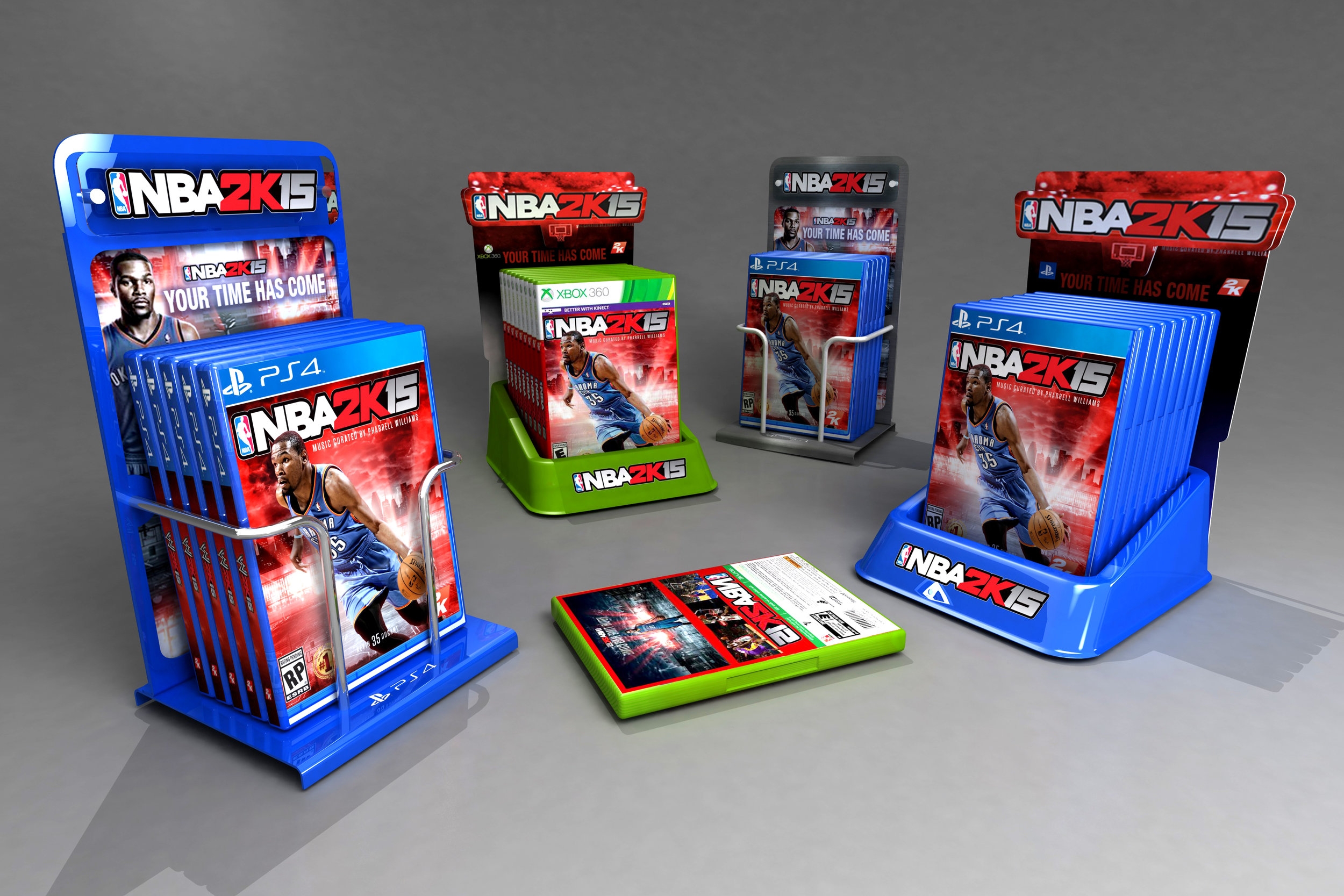
2K Games required a mobile gaming kiosk to use at product launches and events across Australia and NZ. The unit travels in a branded crate to events, and the Gaming Kiosk can be pushed together for a two sided back to back option if required.
Key components of the design included - functionality for both PS4 and Xbox 1 systems, security / easy swap over of all devices, and flexibility for using new graphics for future game launches.
The combination of patented Pixalux® structural light panels with RGB colour variations along with full body inter-changeable magnetic panels provided the answer for immediate brand recognition and crowd participation to ensure maximum exposure at events.
