TIMBER BENCH
Harvey Norman
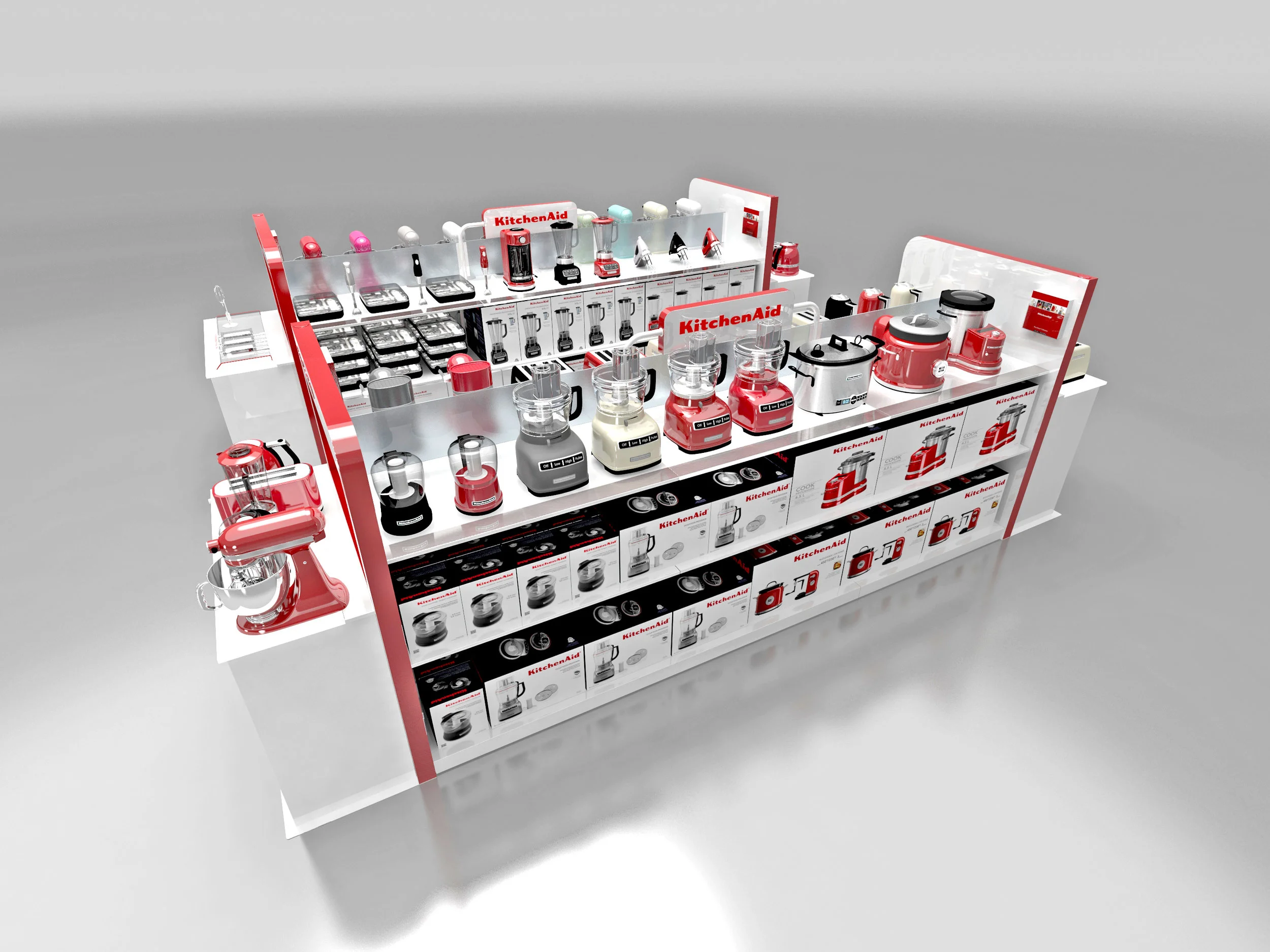
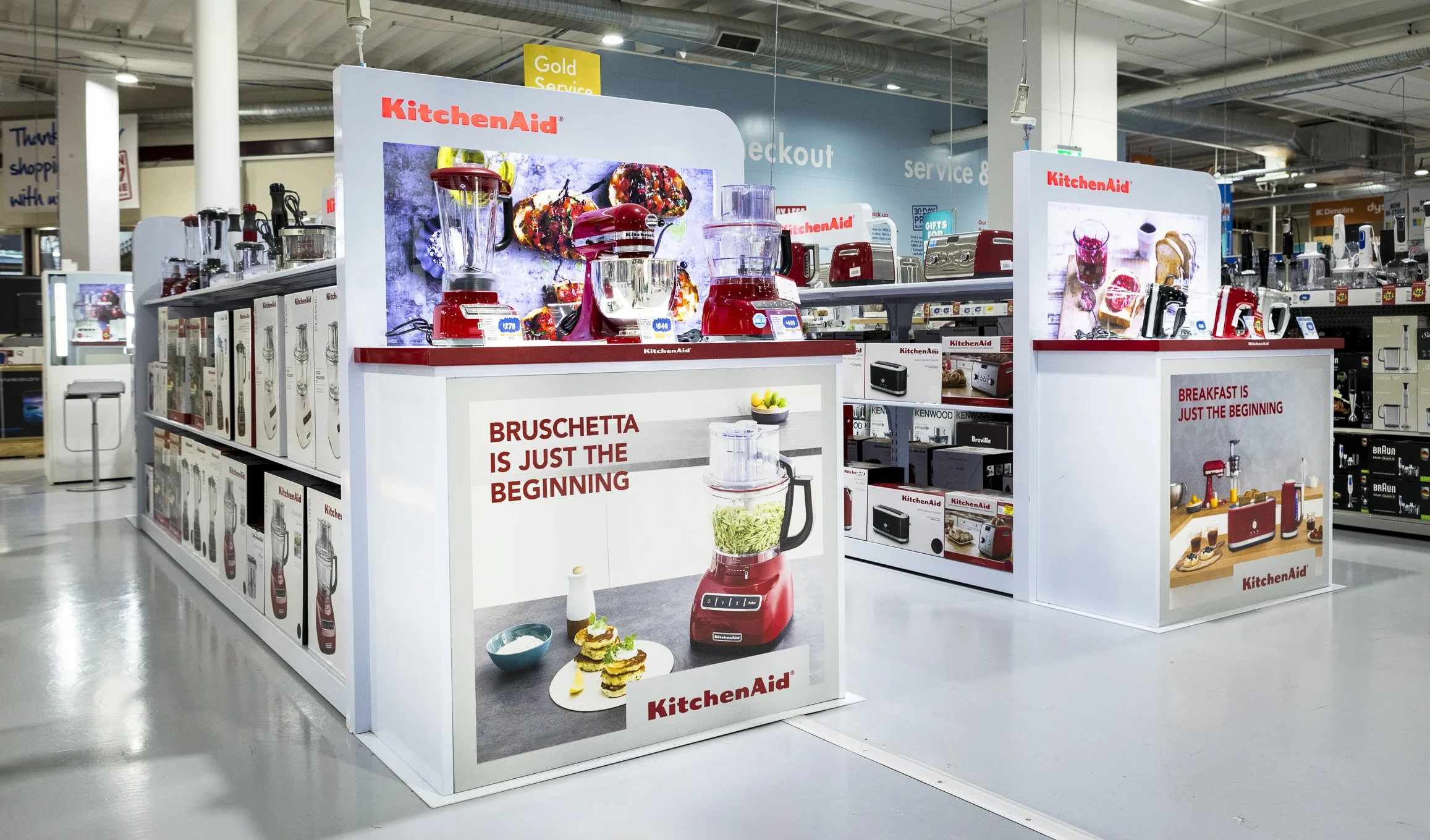
iDesign’s latest project with KitchenAid included designing and producing a modern timber bench to promote the standmixer range at Harvey Norman. The design was to follow the new global design guidelines and to achieve a premium look and feel. For this project iDesign liaised with local specialists in Australia and delivered this beautiful centre piece.
TIMBER END CAP
Harvey Norman
In conjunction with the timber bench iDesign also designed an end cap for the KitchenAid breakfast range. With illuminated logo, adjustable shelf and updateable side graphics, this new end cap adds another piece to KitchenAids transition to the new global design.
CULINARY CENTER FOR PREMIUM RETAILERS
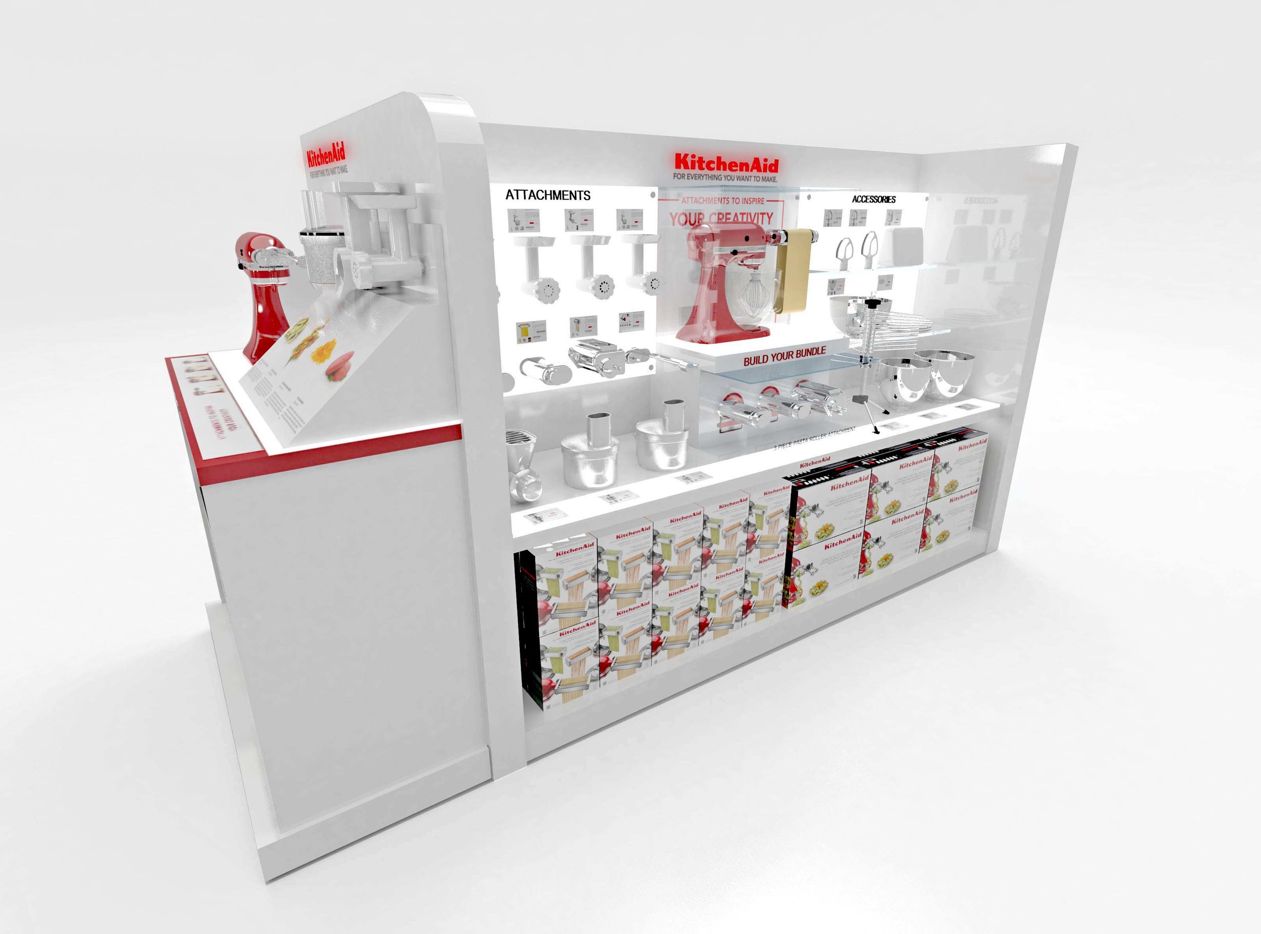
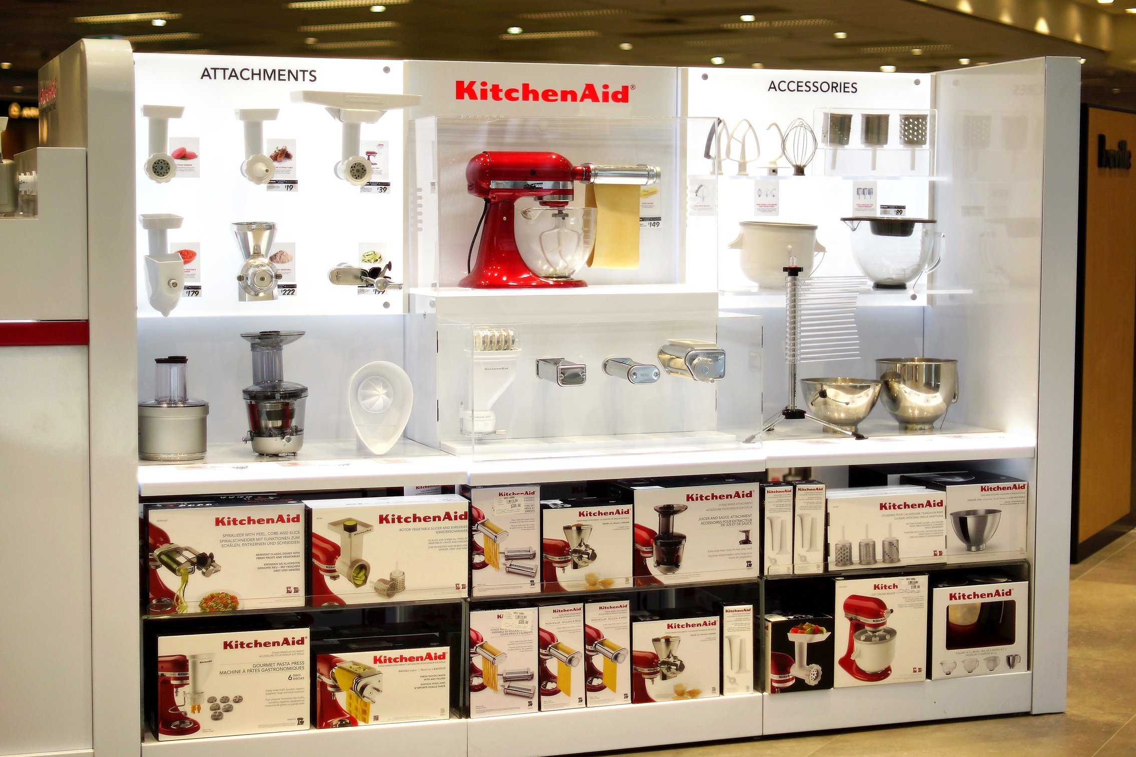
iDesign worked closely with KitchenAid to design the new Culinary Shop in Shop Display to generate sales through accessorising the current 300,000 KitchenAid mixers owned in the Australian market. The design required an area to display mixers on one side, with accessories and attachments on the other side. The endcap showed the accessories story with mixer and attachments with graphics. The rear end had an interactive 55 inch digital screen for surfing product through an in store web based platform linking to the KitchenAid website.
A metalware display with eye catching illuminated Pixalux® light panels featured along all shelf front edges and wall panels. The hero of the display is a fully functioning mixer activated by a motion sensor,.
Strong sales and the interactive nature of the display has ensured success in store, and aligns with brand strategy for 2017-18.
ACCESSORIES SIDE
ATTACHMENT DISPLAY
END CAP
MIXER SIDE
"I rarely endorse agencies but iDesign has been a stand out. They frequently go over and above to deliver, no matter how tight the deadline or ambiguous the scope of work."
Richard Babekuhl - former Marketing Director KitchenAid Australia
Island display
Australia and New Zealand
One of the core strategies for 2017 was growing the KitchenAid brand within major retailers in Australia. An opportunity to secure space in the highly sought after Kitchenware electrical goods category required a free standing table area for demonstration units and boxed stock. Adhering to global brand design standards, saw the displays adapted from a standard wooden design to a premium display in metal.
iDesign - designed, manufactured and installed the displays throughout Australia.
WALL BAY
Australia and New Zealand
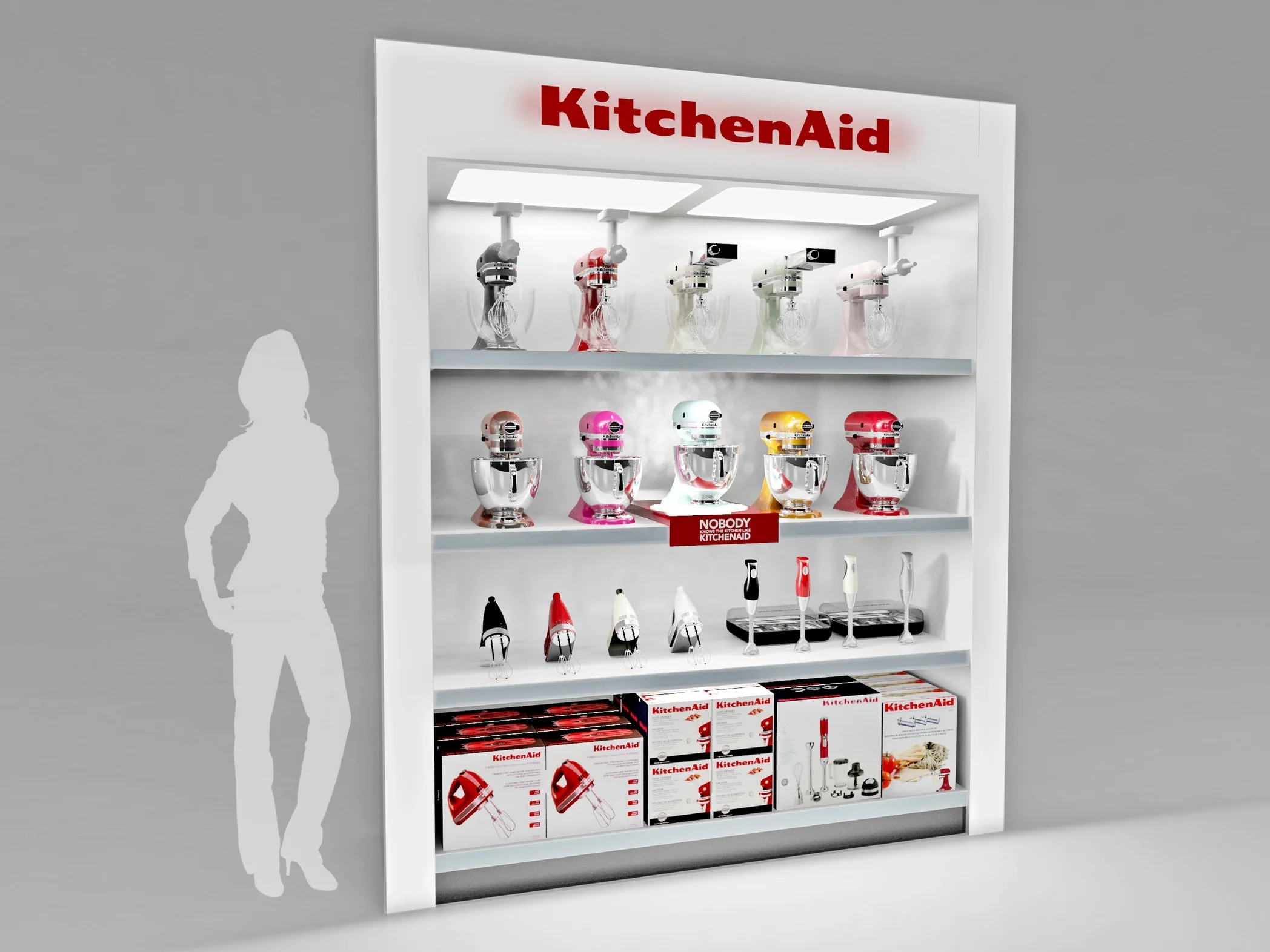
Instore KitchenAid wall displays were tired and not working. iDesign were engaged to find a solution to bring the area “back on brand”. A key requirement was to have a neutral shelving solution to allow maximum product range to be shown. iDesign - designed, manufactured and installed the displays across Australia. Retrofitting a modular flat packed shelving system into an existing cavity required precise engineering and a self-supporting structure able to hold over 200kgs of product weight. The 120mm Pixalux® light panels across the front edge of shelves provided ample down lighting into the cavity and also from the 3x header panels.
iDesign manufactured this locally in Australia and managed installation and logistics throughout all Australian states and selected NZ retailers


